


Every year, Planetizen collects the websites breaking new digital ground in the world of planning and related fields.
If there is one theme to identify in Planetizen’s 2022 “Top Websites list,” it’s an increased attention to the social and environmental outcomes of planning. It’s a welcome theme, as the field of planning is ideally suited to identifying and addressing the intersections between the built and natural environments and the lives of people. Unfortunately, that also means that many of the negative consequences produced at these intersections are the responsibility of historic planning paradigms. The planning of the 21st century, therefore, was always going to be about shifting directions, undoing many of the achievements of 20th century planning. Many of the websites on the 2022 Top Websites for Urban Planning list are actively involved in the effort.
Planetizen has been curating a Top Websites list since 2002 (start your travel back through the history of the planning internet with the 2021 post, perhaps). While the list is subjective, generated during editorial and networking processes throughout the year, specific criteria guide the choices. It’s worth noting that some websites would probably make the list very year, as foundational resources for the field and related professions. We’ve probably identified those sites in the past, and we might again in the future, but expect to discover and explore new sites and less commonly known resources below.
Maps and Visualizations
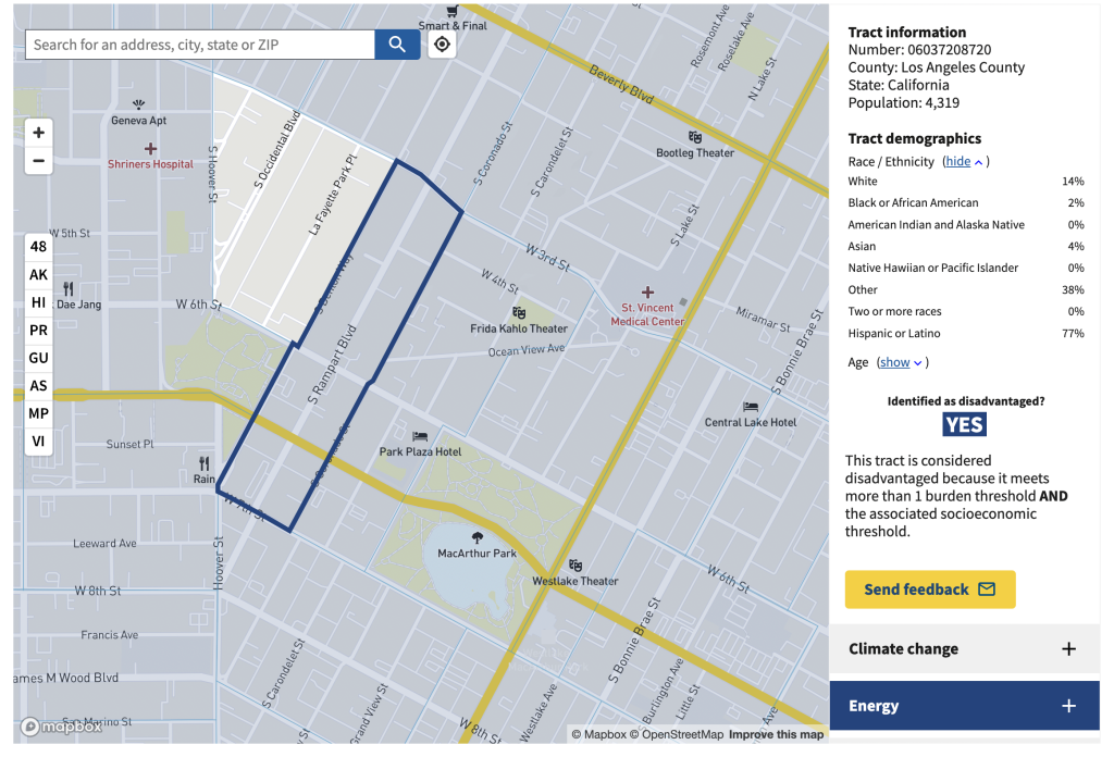
Climate and Economic Justice Screening Tool
One of the defining events of the planning Internet in the past decade was the Mapping Inequality project, an online database of the old redlining maps of the Homeowners Loan Corporation launched in 2017. The project has had a welcome and tangible effect for the causes of economic and social justice. It's one thing to have learned about systemic discrimination in concept or from a text book, but it's one thing to see it rendered in maps that render the cities we navigate and inhabit every day as monuments to discrimination. The obviousness of redlining's pernicious intentions continues to hit home when layered with other contemporary signs of systemic inequality, such as the location of oil drills or persistently poor economic outcomes. The cultural impact of making redlining maps widely and publicly available is no doubt far more vast than can be measured by clicks.
The Climate and Economic Justice Screening Tool will hopefully build on the tradition of the Mapping Inequality project by offering the vast data collection resources of the federal government in a new (published in November 2022) interactive mapping tool—mapping various economic and environmental metrics to the Census tract level. Use the interactive map to identify disadvantaged Census tracts, defined by at least one environmental burden (e.g., legacy pollution from defense, mining, or hazardous waste) and one socioeconomic outcome (e.g., in the 65th percentile or more of low-income residents). My own tract, in Los Angeles, has eight environmental burdens and meets two socioeconomic thresholds. I am sure my neighbors and I deserve better.
A previous generation of non-governmental institutions helped bring maps of social and economic injustice to the internet; we can now add the federal government to the list of institutions leveraging the power of the internet to illustrate the need for more equitable, regenerative public policies through well designed maps.
City Access Map
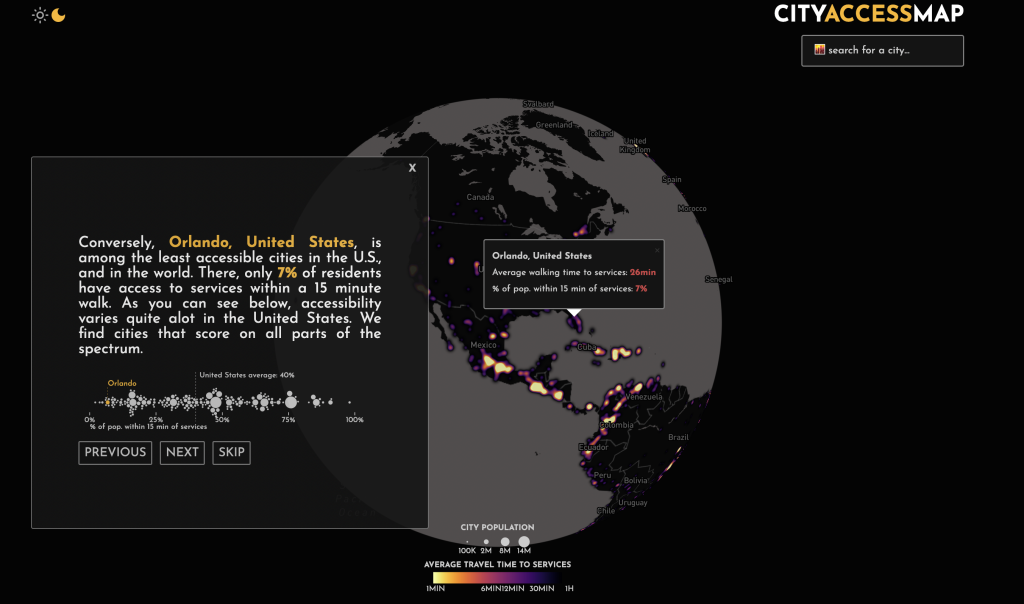
While flipping through the introduction screens of the City Access Map, we learn that 100 percent of Bogotá residents have walkable access to services (defined as a wide array of options, including public transit, libraries, restaurants, grocery stores, hospitals, schools, and more) within 15 minutes. By comparison, 7 percent of residents in the city of Orlando, Florida have the same walkable access. The 15-minute city has been a buzzy term in the more aspirational wings of the planning world for several years now, and like many other planning buzzwords, it might be tempting to dismiss the idea as unrealistic. As shown by the City Access Map, however, the concept is much more realistic than such cynicism allows—this aspirational idea is actually tangible.
The City Access Map provides a great deal of customizability—adjustable sliders allow the user to focus on specific types of services. The site also allows for the data behind the site to be downloaded and explored off the map.
Sure, Orlando might never entirely abandon its commitment to car-centric planning, but it could still make a significant amount of progress toward walkability. This is not just about specific cities in Florida compared to one city in Colombia. The average of the entire United States is only 40 percent; all of France achieves 90 percent walkability. From the American planner's perspective, what we're really mapping here is the effects of more than a century of car-centric planning in the United States. American exceptionalism—in traffic risk and climate arson.
People for Bikes Bicycle Network Analysis
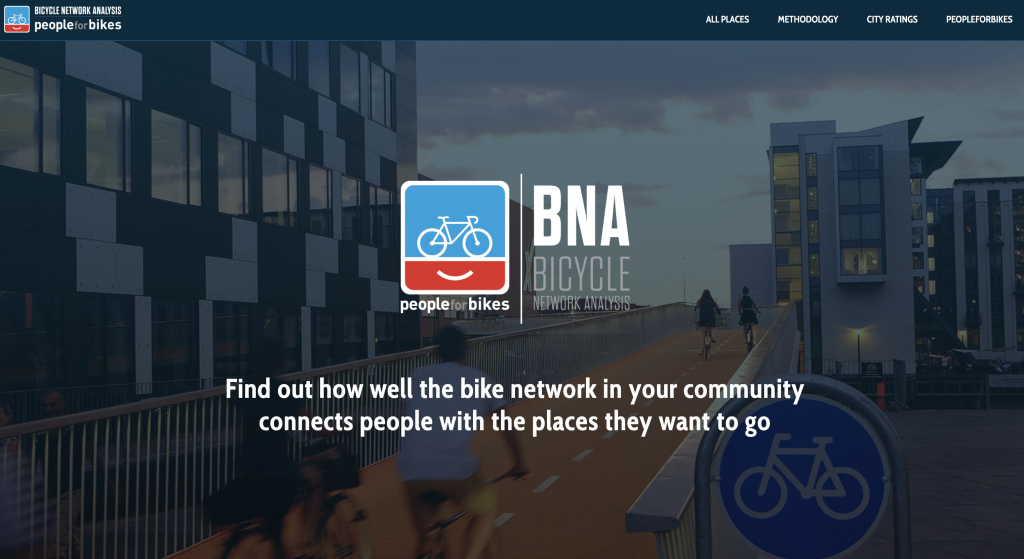
Continuing on the theme of mapping access, one of the leading bicycle advocacy organizations, PeopleforBikes, has created an interactive mapping tool, called the Bicycle Network Analysis (BNA), that uses Open Street Map to calculate bike accessibility to services (methodology), also allowing comparisons between cities around the world. You might be surprised to discover that Fayette, Missouri is at the top of the list among U.S. cities with a BNA score of 88 (Munich, Germany, the worldwide leader, is only two points higher, at 90). So far, the site has produced BNA scores for 1,804 places around the world. The BNA index score for Orlando, Florida, by the way, is 22.
While public transit use has famously declined since the arrival of Covid 19, bike ridership has spiked in big way, in a sign of significant demand for alternative forms of mobility. If bike infrastructure is on the verge of a new wave of investment as a result of the increased popularity, resources like these by PeopleforBikes will contribute to the change.
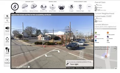
Project Sidewalk
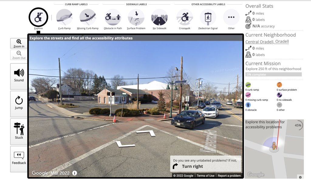
The Americans with Disabilities Act is one of the most consequential regulations for the built environment ever enacted by the federal government—the fact that the law was signed by a Republican president (George H.W. Bush) is noteworthy in today's political climate. But despite the hugely significant influence of the law, the work of retrofitting buildings and public spaces for accessibility has only just begun.
Project Sidewalk provides a venue for the crowd to contribute to the project of ensuring that everyone can move around with freedom and comfort. Project Sidewalk tasks users with moving virtually through cities, completing "missions" that entail identifying accessibility issues, such as missing curb ramps, obstacles blocking paths, and poor surfaces, and assessing the severity of the issue. Users are presented with a neighborhood to start exploring—an example of crowdsourcing at its most broad and internet-enabled, looking beyond our own neighborhoods to contribute to a global understanding of the world and its built environments. According to the website, after the public documents the conditions of streets and surrounding infrastructure, the data is used "to improve city planning, build accessibility-aware mapping tools, and train machine learning algorithms to automatically find accessibility issues."
Let’s go.
The Stitch
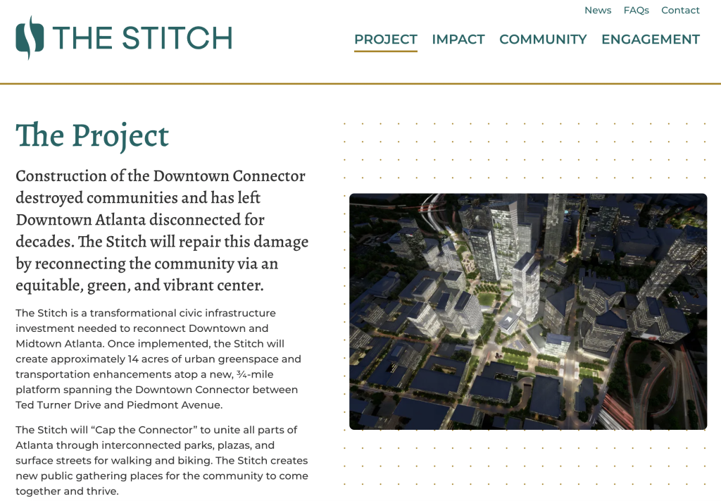
At the top of the website for the Stitch, a freeway cap proposed for Interstate 75/85 in Downtown Atlanta, a slow, animated aerial flight across Downtown Atlanta reveals what might, at first glance, seem like the standard drone-operated economic development material—until some of the road space suddenly disappears, replaced by trees and public space for socializing and recreating. Zoom into renderings of these new spaces conjured from the dirty air above a downtown freeway, one of the defining features of 20th century planning.
There are other development websites with similar technological deployments, and other freeway cap parks have produced similarly snazzy renderings. This is the first freeway cap project to fully deploy the animation, video, and information powers of the contemporary internet for such a progressive purpose—one which will require a deep commitment to a new way of thinking about urban spaces. Changes like these don't come cheap, so outreach like this will be critical in building political and public support for such ambitions.
But this website appears on this list because it showcases the first freeway cap project to rise to prominence in an era of transportation planning defined by the existence of the Reconnecting Communities program and other federal programs designed to fund projects just like this. Projects like the Stitch are suddenly possible in a way that they've never been before, even if they still have a long way to go to become the norm.
Put another way, this is also the first freeway cap website to include a quote by the secretary of the U.S. Department of Transportation. Secretary Pete Buttigieg has this to say about the Stitch: "When there’s a vision coming from the community about how to reconnect and create new usable land and greenspace, that’s something we want to accelerate. The Stitch is a great way to make use of old right of way. And it takes into account all the things that matter for the future."
Urbanize - Project Map
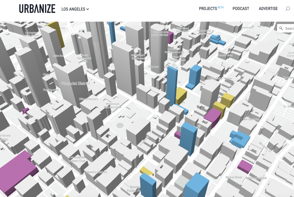
Urbanize made this list in 2021 for expanding beyond its original home in Los Angeles—to Atlanta, Austin, Chicago, Detroit, and New York. At the time, I wrote that Urbanize was "beating Curbed at its mid-aughts and early-'10s game: consistently breaking news on the projects and the plans driving the transformation of some of the biggest, most compelling cities in the country."
Urbanize this year makes the list for launching a new development visualization tool that continues to push planning and development media in a constructive direction. The new "Project Map" tool, still in beta, allows users to explore the developments planned for the city. Blue buildings, as seen in the screengrab above, show proposed buildings, green for approved, yellow for construction, and pink for completed. Similar websites created in the past have shown a similar taxonomy of development on two dimensional parcel maps. The Urbanize Project Map provides an idea of the massing, height, and design of the proposed buildings—a three dimensional visualization of the city as it might be. Crowdsourcing is allowed, supplementing the reportage of the site with a much more comprehensive reach.
The Project Map also has the benefit of showing the changes of the city as incremental and slow-dispelling the notion that any one project or policy might suddenly turn a city into a scene from Blade Runner. Planning and development takes time.
Making Plans
Better Streets for Buses
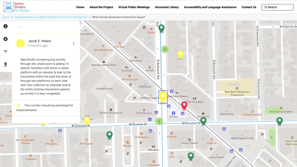
The Chicago Department of Transportation and the Chicago Transit Authority launched the Better Streets for Buses planning process to the public in April 2022, with a goal for implementing street reconfigurations and other infrastructure changes to improve bus service in the city. Surprisingly, for such a transit-oriented city, Chicago has very little street priority devoted to bus transit—despite the fact that far more people ride the city's buses than the city's famous CTA system.
While the politics of these changes are far from a sure thing, the Better Streets Better Buses website served as an effective and exciting forum for public feedback to at least make it clear that the public wants to see a lot of changes, with an interactive map densely populated with ideas for improvements. The website sets the playing ground well for productive discussion, with toolkits, a definition library, and other documentation supplementing the map with clear, dynamic explanations for the various esoteric concepts of transit service design.
Part of our hope in including this site on the list is that we'll see more like it, both in content and execution, in the future, as transit agencies look for ways to ensure transit service in a post-pandemic era of decreased overall ridership, but improved awareness of the connections between transit and equity. The Better Streets Better Buses site was only open for business for a few weeks. The idea that streets should facilitate the most efficient modes, which deliver the largest benefits to the people most in need, should stick around for awhile.
New York City Capital Planning Explorer and Equitable Data Explorer
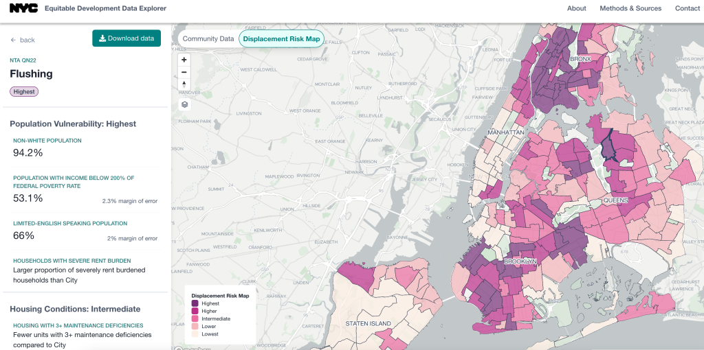
The Council on Environmental Quality isn't the only government institution to make this list by committing to improved transparency on the environmental and social consequences of planning. The New York Department of City Planning continues strong recent work in the realm of technology with two big website launches in the past calendar year: the Capital Planning Explorer and the Equitable Development Data Explorer.
The Capital Planning Map "builds on an existing map of city facilities by adding details about all City-funded capital projects in the five boroughs, alongside geographic views of housing permits," according to a DCP press release announcing the new tool. If budgets, more than plans, reflect the values of communities, it's no wonder that so many cities and governments are less than transparent with their intentions. The city of New York is committed, at least as exemplified here by the DCP, to new forms of transparency.
That commitment to transparency is perhaps more poignantly represented with the Equitable Development Data Explorer, launched in April 2022, which sheds new light on issues of fair housing, displacement, and racial justice in the city. The explorer isn't a one-off. The Equitable Development Data Explorer includes a displacement risk map, and the city is one of the first in the nation to require racial impact analysis in planning processes.
Ventura County General Plan
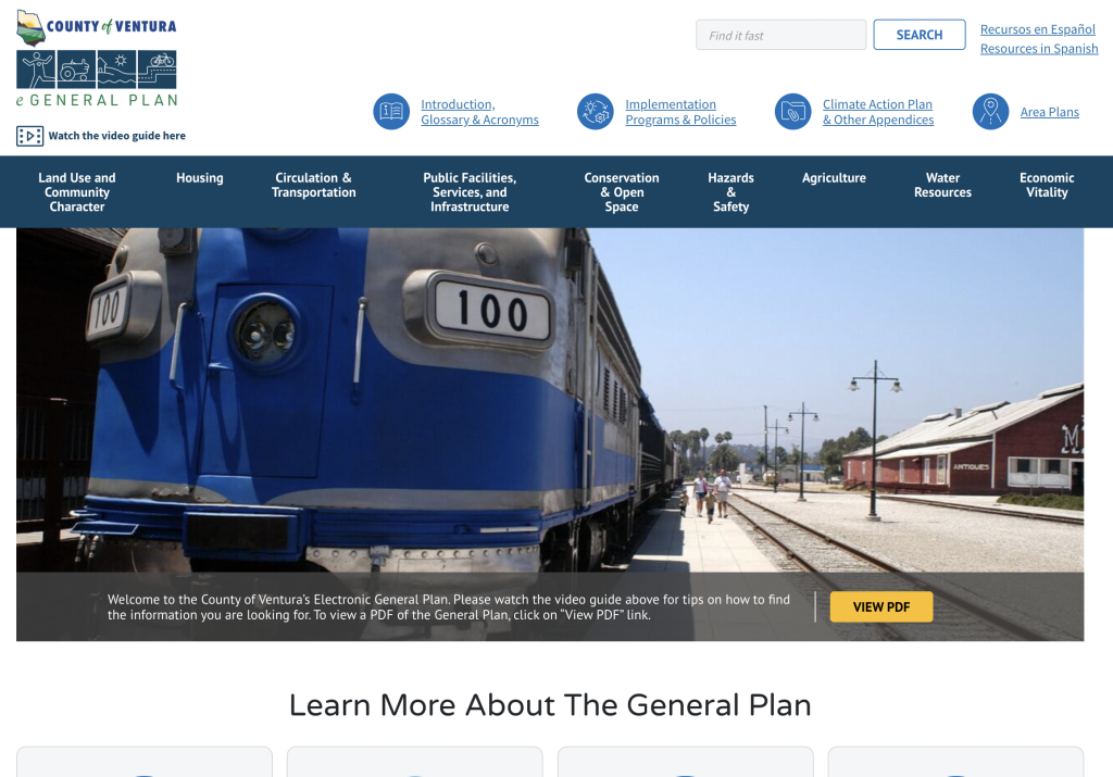
The county of Ventura, California, recently launched an interactive website to display the extensive contents of its 2040 General Plan, which would otherwise only be available in a 598-page PDF. The online version of the plan, allows for the customized design and of content types, such as programs and policies, and taxonomies, such as goals, elements, departments, and more. The obvious need to break planning documents free of their PDF prisons is quite clear with this example.
Other nifty features include filter tables for programs and policies (clicking through that link offers immediate evidence of the unique planning environment presented by Ventura County), allowing users to refine filter criteria and export results as a CSV, as well as a bookmarking feature.
As of 2019, 92 percent of cities documented their plans and policies in PDF format, as documented by a Planetizen benchmarking survey. While the field might still be catching up with the internet while working with the constrained budgets of municipalities, Ventura County is leading the way toward a more internet-enabled profession. The public stands to be the primary beneficiary. (Disclosure: the Ventura County General Plan website was developed under contract by Urban Insight—the sister company of Planetizen).
The Center Square
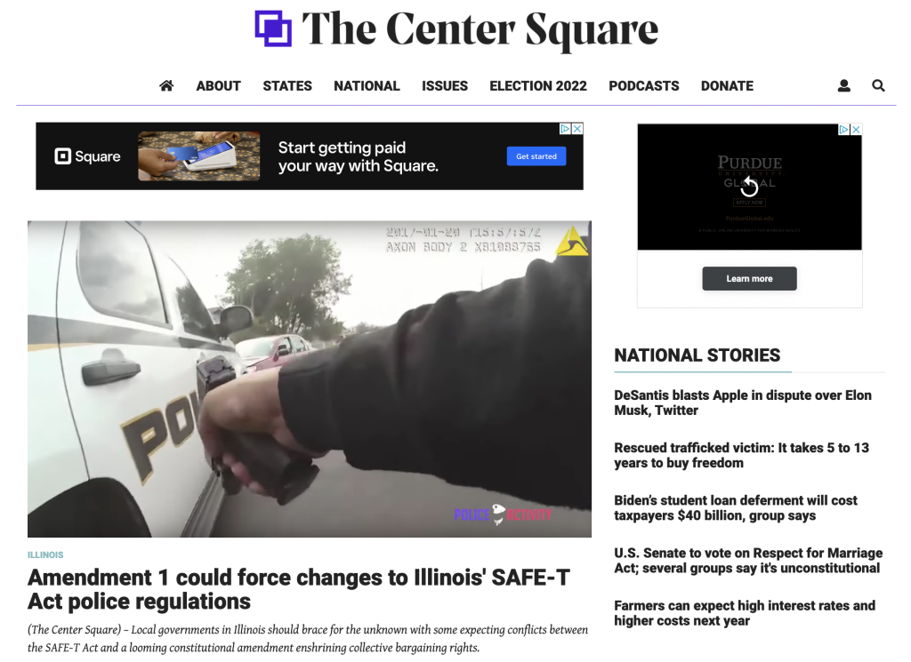
The Center Square made known its utility while I was preparing the election roundup from the mid-term elections in November 2020. Up until that point, the Center Square didn't have a spot among the hundreds of sites that had produced articles that found their way into the Planetizen newsfeed. But during the process of putting together the election recap, the Center Square was repeatedly the only publication covering some of the local and state legislation that will determine how planning priorities and capital investments are prioritized in the coming years. Helpfully, the Center Square was covering issues in locations far off the radar of The Washington Post and other big national sites with a traditional focus on politics.
According to the site's About page, The Center Square was launched in May 2019 "to fulfill the need for high-quality statehouse and statewide news across the United States." The site does, indeed, have pages for all 50 states. A focus on fiscal matters is obvious from reading through the site's newsfeed, but the site describes its editorial practices thusly: "A taxpayer sensibility distinguishes our work from other coverage of state and local issues. As a result of this approach, our readers are better informed about the focus of state and local government and its cost to the citizens whose tax dollars fund governmental decisions." A little more digging reveals that the site is is a project of the 501(c)(3) Franklin News Foundation, which, according to Wikipedia, "publishes news and commentary from a free market, limited government perspective on state and local politics." The Center Square also relies on donations for funding.
While the foundation's libertarian and conservative background might scare some readers off, the need for coverage of what and how governments are spending taxpayer money should be obvious. The news coverage on the Center Square has been totally free from partisan spin in our exposure so far. Perhaps other conservative outlets could take a queue from this example.

Top Websites for Urban Planning – 2021
Planetizen's annual list of the best of the urban planning Internet.
Top Planning Websites - 2017
The annual list of best websites by and for planners (and anyone else interested in planning).
Mapping Environmental Justice to Census Tracts
The Climate and Economic Justice Screening Tool, version 1.0, is now available on the internet.

Planetizen Federal Action Tracker
A weekly monitor of how Trump’s orders and actions are impacting planners and planning in America.
Maui's Vacation Rental Debate Turns Ugly
Verbal attacks, misinformation campaigns and fistfights plague a high-stakes debate to convert thousands of vacation rentals into long-term housing.
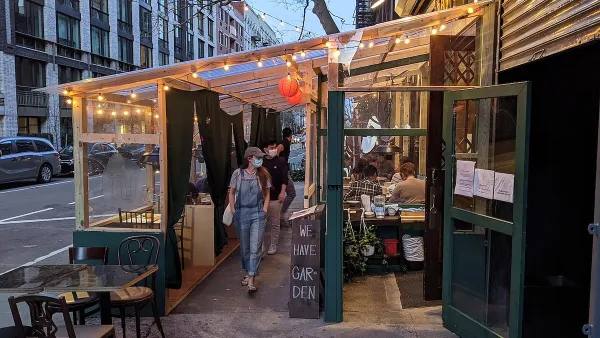
Restaurant Patios Were a Pandemic Win — Why Were They so Hard to Keep?
Social distancing requirements and changes in travel patterns prompted cities to pilot new uses for street and sidewalk space. Then it got complicated.

In California Battle of Housing vs. Environment, Housing Just Won
A new state law significantly limits the power of CEQA, an environmental review law that served as a powerful tool for blocking new development.

Boulder Eliminates Parking Minimums Citywide
Officials estimate the cost of building a single underground parking space at up to $100,000.

Orange County, Florida Adopts Largest US “Sprawl Repair” Code
The ‘Orange Code’ seeks to rectify decades of sprawl-inducing, car-oriented development.
Urban Design for Planners 1: Software Tools
This six-course series explores essential urban design concepts using open source software and equips planners with the tools they need to participate fully in the urban design process.
Planning for Universal Design
Learn the tools for implementing Universal Design in planning regulations.
Heyer Gruel & Associates PA
JM Goldson LLC
Custer County Colorado
City of Camden Redevelopment Agency
City of Astoria
Transportation Research & Education Center (TREC) at Portland State University
Jefferson Parish Government
Camden Redevelopment Agency
City of Claremont