


Harvard University's Global Health Insititute and Edmond J. Safra Center for Ethics have launched a new online tool for planners, policy makers, and the public to determine the severity of the coronavirus outbreak in one's county and state.

"The public needs clear and consistent information about COVID risk levels in different jurisdictions for personal decision-making, and policy-makers need clear and consistent visibility that permits differentiating policy across jurisdictions," explains Danielle Allen, director of the Edmond J. Safra Center for Ethics at Harvard University. “We also collectively need to keep focused on what should be our main target: a path to near zero case incidence.”
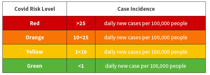
"A path to zero" should have resonance with Planetizen readers familiar with mitigation strategies to reduce greenhouse gas emissions to fight climate change. Harvard has applied the terminology to the pandemic – coronavirus case incidence, as measured in new cases determined by diagnostic testing, per 100,000 people, using a seven day rolling average, needs to be reduced as much as possible to suppress COVID-19.
The new "zero" or "near zero" is appropriately colored green that communities should strive for in order to reduce the risk of infection to the greatest extent possible.
The new framework brings clarity to metrics that help communities determine the severity of the outbreak they are responding to. A new COVID Risk Level map shows if a county or state is on the green, yellow, orange or red risk level, based on the number of new daily cases. The framework then delivers broad guidance on the intensity of control efforts needed based on these COVID risk levels. It offers key performance indicators for testing and contact tracing across all risk levels, as a backbone for suppression efforts.
To familiarize yourself with the purpose and function of the risk map, I recommend a 3-minute listen to NPR's introduction to the new tool which was unveiled on July 1 by a "convergence group" that includes the Rockefeller Foundation, CovidActNow, Covid-Local, and the Center for Infectious Disease Research and Policy at the University of Minnesota.
Allison Aubrey and Carmel Wroth, correspondents for NPR News, write:
For the public, this means you can now compare the case incidence where you live to that of, say, a nearby county where you're considering going on an errand. Or the county where your parents live if you're considering a visit. It gives you a way to assess your community's risk level compared to others, at a glance, and modify your behavior accordingly.
For policy-makers, the risk levels are meant to signal the intensity of the effort needed to control COVID-19 and to trigger specific interventions. The collaborative released guidance for how state and local leaders should manage their response, depending on their risk level.
An example
Checking on my county and state on July 27, I see that San Mateo, California, is at orange level (as is the entire Bay Area) with 10.4 new daily new cases per 100k people (7-day moving average), while neighboring Santa Cruz County is yellow, with 6.6 daily new cases. Only Alpine, Sierra, and Modoc counties, the three least-populated in the state, are green, on the path to containment.
"At orange levels, community spread has accelerated and is at dangerous levels," states the framework document, "Key Metrics for COVID Suppression" [pdf]. Stay- at-home orders are advised, unless viral testing and contact tracing capacity are implementable at levels meeting surge indicator standards," are indicated under "Intensity of Control Effort Needed" in the color-coded table on top of page 3 of for orange level counties.
Two other metrics, in addition to diagnostic testing, are used to determine case incidence:
- "Metric 2: Case trend as an estimate from new deaths trend: New daily deaths per 100k pop * 100 (assuming 1% [infection fatality rate] IFR) (seven day rolling average); + trend direction and rate
- "Metric 3: New daily hospitalizations per 100k pop (seven day rolling average); + trend direction and rate"
Finally, Danielle Allen was featured in the July 1 Politico Magazine. In some ways, she sounds a bit like Anthony Fauci, the nation's top epidemiologist, in a recent post. "If you think the coronavirus pandemic is simply a health crisis, or a crisis of leadership in Washington, it’s time to wake up," writes Zack Stanton.
This moment is nothing less than an “existential crisis” that will reshape American society, says Danielle Allen, head of Harvard’s Safra Center for Ethics and co-author of the university’s “Roadmap to Pandemic Resilience [pdf].” “It is a moment where societies are forced to answer the question of who they are. And I think [the U.S.] didn’t answer that question terribly well."
Related in Planetizen:
- U.S. Needs to More Than Triple Testing Before States Can Open, Study Says, April 20, 2020
-
Blog post: How City Planning Can Affect How Diseases Spread, June 10, 2018
-
The 1854 Map That Transformed Public Health in Urban Areas, November 11, 2017

'By the Numbers': California Shows How to Reopen Safely
Unlike other states that lifted restrictions statewide after coronavirus cases plummeted, California replaced its regional stay-home order with a county-based blueprint, permitting counties to advance based on performance in three health metrics.

Where the Coronavirus Is on Track for Containment in the U.S.
As the virus surges throughout the South and West and heads north into the Midwest, the Northeast is the one region that has weathered the current phase of the pandemic the best. As of July 21, only one state in the U.S. is on track to contain COVID.
Pandemic to End in California on June 15, Governor Decides
Gov. Gavin Newsom has foreseen the end of the pandemic that has killed over 61,000 Californians and has taken a page from his Republican counterpart in the second most populous state by setting a date when all restrictions will be lifted.

Maui's Vacation Rental Debate Turns Ugly
Verbal attacks, misinformation campaigns and fistfights plague a high-stakes debate to convert thousands of vacation rentals into long-term housing.

Planetizen Federal Action Tracker
A weekly monitor of how Trump’s orders and actions are impacting planners and planning in America.

In Urban Planning, AI Prompting Could be the New Design Thinking
Creativity has long been key to great urban design. What if we see AI as our new creative partner?

King County Supportive Housing Program Offers Hope for Unhoused Residents
The county is taking a ‘Housing First’ approach that prioritizes getting people into housing, then offering wraparound supportive services.

Researchers Use AI to Get Clearer Picture of US Housing
Analysts are using artificial intelligence to supercharge their research by allowing them to comb through data faster. Though these AI tools can be error prone, they save time and housing researchers are optimistic about the future.

Making Shared Micromobility More Inclusive
Cities and shared mobility system operators can do more to include people with disabilities in planning and operations, per a new report.
Urban Design for Planners 1: Software Tools
This six-course series explores essential urban design concepts using open source software and equips planners with the tools they need to participate fully in the urban design process.
Planning for Universal Design
Learn the tools for implementing Universal Design in planning regulations.
planning NEXT
Appalachian Highlands Housing Partners
Mpact (founded as Rail~Volution)
City of Camden Redevelopment Agency
City of Astoria
City of Portland
City of Laramie