Interactive Maps

New Interactive Mapping Tool Tracks all of NYC's Infrastructure Projects, Housing Permits, and City Facilities
The New York Department of City Planning has taken its open data practices to a new level with the launch of the Capital Planning Explorer.

Smart Growth Loves Heatmaps
Smart growth can provide many important benefits that are easy to see using informative and beautiful heatmaps—our complex world as viewed by all-knowing gods.

Using Artificial Intelligence to Map Telecommuting Prevalence
In the Philadelphia region, residents of wealthier neighborhoods will be more likely to work from home in the future, thus altering travel patterns and transit usage, according to a new mapping project powered by artificial intelligence (AI).
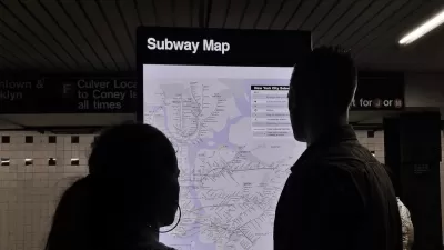
The New York Subway Map, Explained
An interactive feature reveals the origins and design choices of the New York Subway map.

A Detailed Map of the Nation's Auto Emissions
The New York Times illustrates the scope and scale of the great project still facing the United States: to decrease greenhouse gas emissions from the transportation sector of its economy.

The 'Economic Value Atlas': A New Tool for Assessing Economic Development
In an effort to generate a new approach to economic development and infrastructure investment, the Brookings Institution has developed a new "Economic Value Atlas."

Compare Transit Ridership in U.S. Cities
A new interactive tool called Transit Insights offers access to the local trends of transit ridership.
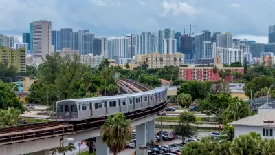
New Tool Puts Miami Development Opportunities on the Map
There's plenty of vacant or underutilized land to be found in Miami-Dade County, if you know where and how to look.

Interactive Mapping Tool Illustrates the Impact of California's Big Housing Bill
University of California, Berkeley researchers have mapped the impact of SB 50, a bill that would allow new density around train stations and bus stops in cities all over the state of California.

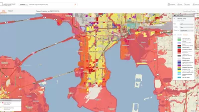
Deep Economic and Racial Injustice Found in California Pollution Exposure
A new study confirms the facts of environment justice that has long been common knowledge in affected communities. Now the evidence can be mapped, as well.

Interactive Maps of Flooding Risks Offer New Climate Planning Tools
"Neighborhoods at Risk" offers new tools for illustrating the threats posed to communities by climate change.

Mapping Change – A New Interactive Tool for Boston
The latest example of the Internet's power to make deliver data and maps to the masses, produced by the Joint Center for Housing Studies of Harvard University.

Visualizing Density in New Jersey
An interactive map shows the surprising density of the Garden State.
Top Planning Websites – 2018
Planetizen's annual list of the most useful and innovative websites by and for planners (and every person interested in planning).

Mapping the Pacific Northwest's Changing Population
The Oregonian has published a new interactive mapping feature that allows users to map demographic changes to the Census tract level through Oregon and Washington.

Mapped: Racial Demographics, Down to the Census Block
An interactive map created by National Geographic creates a detailed look at the racial makeup of the United States.
District By District, Maps Trace Neighborhood Opportunity Across the U.S.
Down to the level of individual census tracts, a team of researchers has developed national maps showing where upward mobility is probable, and where it isn't.

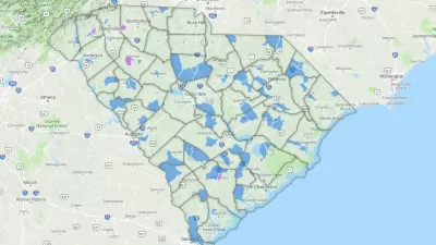
Mapping D.C.'s Affordable Housing Investment
The District has created thousands of affordable homes, but analysts see a need for more targeted intervention.
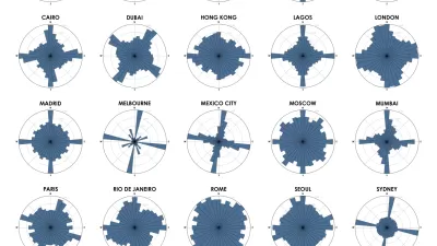
Chart Your City's Street Network to Understand its Logic
The roads in your city might conform to a grid, or they might divert around natural resources or landmarks. A new tool aims to help you visualize the "hidden logic" behind urban growth.

Mapping All of San Francisco's Transit-Related Projects
A new interactive map keeps residents up to date on where the San Francisco Municipal Transportation Agency is working on new projects.
Urban Design for Planners 1: Software Tools
This six-course series explores essential urban design concepts using open source software and equips planners with the tools they need to participate fully in the urban design process.
Planning for Universal Design
Learn the tools for implementing Universal Design in planning regulations.
planning NEXT
Appalachian Highlands Housing Partners
Mpact (founded as Rail~Volution)
City of Camden Redevelopment Agency
City of Astoria
City of Portland
City of Laramie