


Smart growth can provide many important benefits that are easy to see using informative and beautiful heatmaps—our complex world as viewed by all-knowing gods.

Smart Growth development policies create compact, multimodal communities. This can provide many benefits: residents of compact, multimodal neighborhoods tend to save on transportation costs, spend less time travelling, have lower traffic fatality rates, consume less energy and produce less pollution than they would if located in automobile-dependent areas. That information is great, but not always persuasive. Planners need to show people what these benefits look like.
New geographic information systems (GIS) allow us to see our complex world like all-knowing gods. With the right datasets you can produce color-coded heatmaps (or "choropleth" if you want to impress people with big words) showing how various factors vary from one area to another. In recent years, several organizations have developed dynamic mapping system that allow users to choose areas, data layers, filters, and presentation features. The results can be useful and beautiful. Let me share some of my favorites.
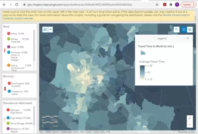
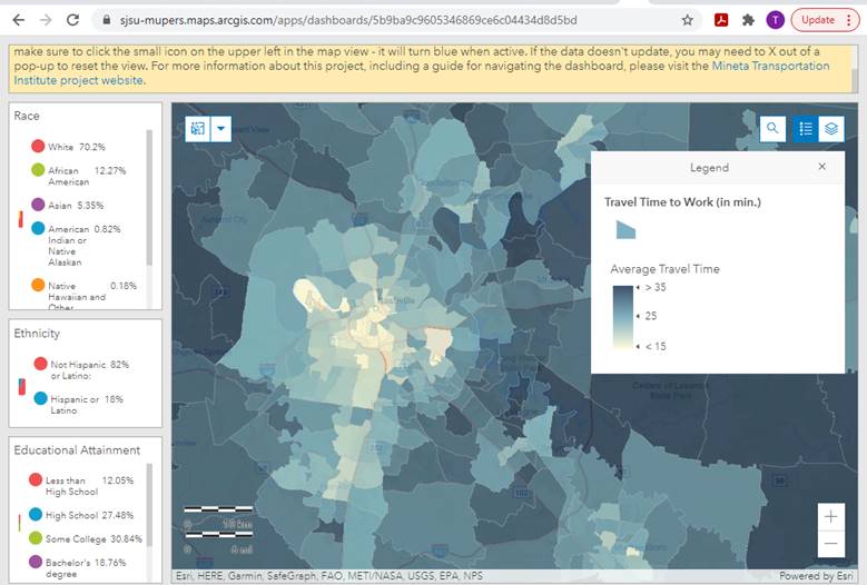
The Mineta Transportation Institute’s new Commute Duration Dashboard, illustrates commute duration (average minutes per commute) for most U.S. communities, plus residents' demographic data. One dashboard presents census tract data and another shows county level data. Below is the view of the Nashville, Tennessee region, a city of which I am particularly fond. Darker color indicates longer duration commutes. It shows that central neighborhood residents tend to spend significantly less time commuting than workers in outer suburbs, a pattern found in most urban regions. If you want a shorter commute, choose a Smart Growth neighborhood.
Mineta Transportation Institute Commute Duration Dashboard
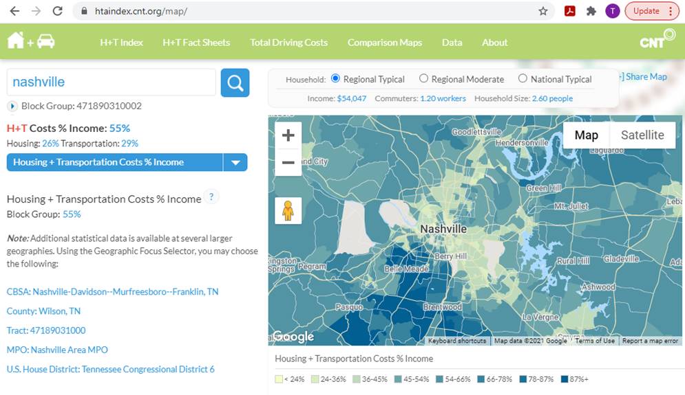
The map below, from Center for Neighborhood Technology’s Housing + Transportation Affordability Index, shows the portion of household budgets that households must devote to housing and transportation expenses for various Nashville neighborhoods. The maps can be adjusted to show housing or transportation affordability separately, and different affordability metrics. These maps indicate that central neighborhoods tend to offer the best value, particularly for lower-income families.
CNT Housing + Transportation Affordability Index
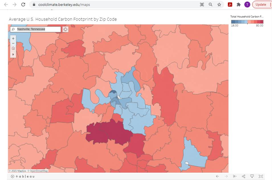
UC Berkeley’s Cool Climate Maps shows household's carbon emissions, taking into account emissions from transportation, housing, and consumer goods. The blue area in the center of the map also shows Nashville. It indicates that central neighborhood households produce far lower emissions, less than half, as residents of sprawled, automobile-dependent areas. If you want less pollution, support compact infill development.
UC Berkeley Cool Climate Maps
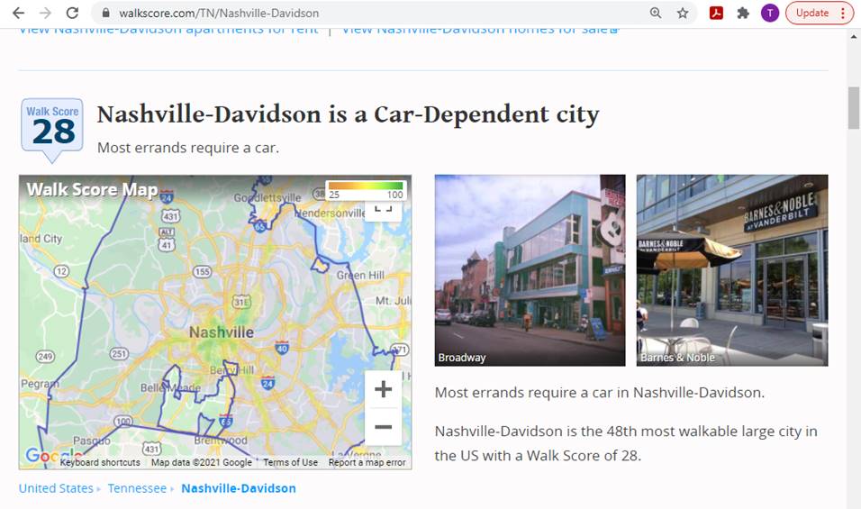
Below is Nashville's Walk Score heatmap. Overall, the city rates poorly, a score of 28 out of 100, but some neighborhoods rate much better. You can find similar maps for Bike Scores and transit access. If you want more healthy and enjoyable exercise, locate in a central, walkable neighborhood.
Walk Score
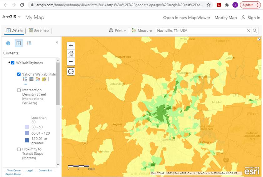
The U.S. Environmental Protection Agency’s National Walkability Index uses a sophisticated GIS mapping system to shows various metrics related to walking conditions. Once again I show Nashville, and once again central neighborhoods and the centers of small towns, rate far better than automobile-dependent sprawled areas.
U.S. EPA National Walkability Index
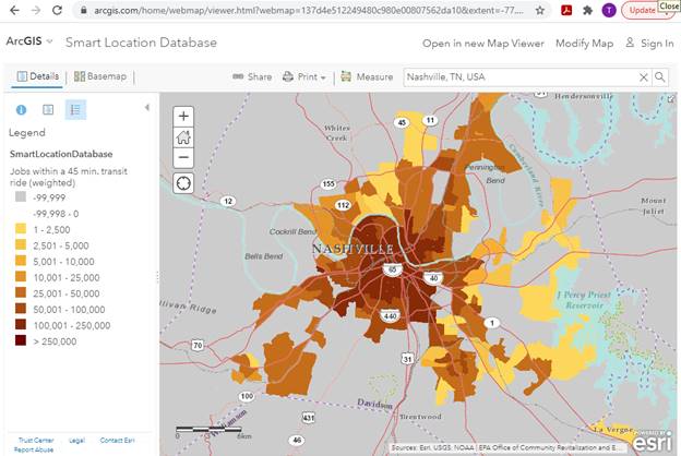
The Walking Index is just one of several GIS maps included in the U.S. EPA’s Smart Location Database, which shows various built environment metrics including density, diversity, design, transit quality, and accessibility. The map below shows the number of jobs reachable within a 45-minute transit trip in Nashville. Unsurprisingly, transit access is far better in central neighborhoods than in outlying areas. If you want more independent mobility and economic opportunity for non-drivers, build more affordable housing in central neighborhoods.
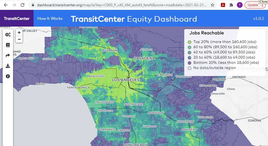
The TransitCenter Equity Dashboard shows local public transit performance factors including service intensity, affordability, reliability, access to opportunity, and travel times compared with automobile. Unfortunately, it currently only covers six U.S. urban regions but is expanding. Below is a heatmap showing the portion of jobs accessible by transit in the Los Angeles region.
TransitCenter Equity Dashboard
Although these mapping systems reflect different impacts and perspectives, they all have similar results: more central, multimodal neighborhoods tend to perform much better.
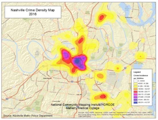
However, heatmapping can be used inappropriately, when information is presented without accounting for all factors. For example, the map below shows Nashville's crime density, crimes per acre or hectare. This implies that central areas are most dangerous, but this does not account for other risk factors. Those central areas tend to have high population densities and lots of commercial activities that generate crimes. For example, bank robberies only occur in commercial centers where banks are located, and bar fights occur primarily in entertainment districts where there are lots of bars. This map does not really demonstrate that crime rates will increase, or that most people will experience more crime risk, by locating in a central neighborhood.
Nashville Crime Density Map
Knowledge is power, and heatmaps provide knowledge in a wonderfully accessible format. I love them, but use with caution! Be sure that you can explain what they illustrate, and be aware of how they may misrepresent key issues.


New Interactive Mapping Tool Tracks all of NYC's Infrastructure Projects, Housing Permits, and City Facilities
The New York Department of City Planning has taken its open data practices to a new level with the launch of the Capital Planning Explorer.

Getting to Work: New Commute Duration Heatmaps
The Mineta Transportation Institute's new interactive website produces heatmaps that illustrate commute duration—the number of minutes that workers spend traveling to their jobs—plus related information, for most U.S. communities.

USDOT Releases Climate Strategies Playbook
The USDOT's new Climate Strategies that Work Playbook provides detailed information concerning benefits and implementation requirements for 27 transportation-related emission reduction strategies.

Maui's Vacation Rental Debate Turns Ugly
Verbal attacks, misinformation campaigns and fistfights plague a high-stakes debate to convert thousands of vacation rentals into long-term housing.

Planetizen Federal Action Tracker
A weekly monitor of how Trump’s orders and actions are impacting planners and planning in America.

In Urban Planning, AI Prompting Could be the New Design Thinking
Creativity has long been key to great urban design. What if we see AI as our new creative partner?

King County Supportive Housing Program Offers Hope for Unhoused Residents
The county is taking a ‘Housing First’ approach that prioritizes getting people into housing, then offering wraparound supportive services.

Researchers Use AI to Get Clearer Picture of US Housing
Analysts are using artificial intelligence to supercharge their research by allowing them to comb through data faster. Though these AI tools can be error prone, they save time and housing researchers are optimistic about the future.

Making Shared Micromobility More Inclusive
Cities and shared mobility system operators can do more to include people with disabilities in planning and operations, per a new report.
Urban Design for Planners 1: Software Tools
This six-course series explores essential urban design concepts using open source software and equips planners with the tools they need to participate fully in the urban design process.
Planning for Universal Design
Learn the tools for implementing Universal Design in planning regulations.
planning NEXT
Appalachian Highlands Housing Partners
Mpact (founded as Rail~Volution)
City of Camden Redevelopment Agency
City of Astoria
City of Portland
City of Laramie