


The Mineta Transportation Institute's new interactive website produces heatmaps that illustrate commute duration—the number of minutes that workers spend traveling to their jobs—plus related information, for most U.S. communities.
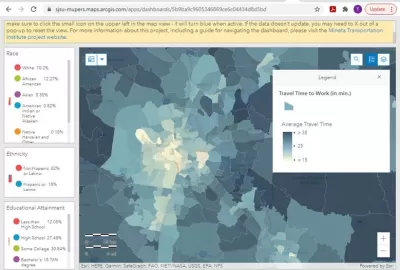
The Mineta Transportation Institute’s new interactive Commute Duration Dashboard, illustrates commute duration (average minutes per commute), plus key demographic information including income, gender and race, for most U.S. communities. From the dashboard's abstract:
Transportation planning is shifting from mobility-based to accessibility-based analysis. Mobility-based planning evaluates transportation system performance based primarily on travel speed. Accessibility-based planning evaluates system performance based on time, the amount of time required to access desired services and activities such as work, school and shops. This new paradigm recognizes that many factors can affect accessibility, including mobility (travel speed), proximity (the distances between destinations, and therefore development density and mix), transport system diversity (the variety of travel modes available at a time and place), transport network connectivity (the quality of connections between modes), and affordability.
For various levels of analysis, the dashboard presents both Census tract data and county-level data. These maps show that in must urban regions, workers in central neighborhoods spend significantly less time commuting than in sprawled, automobile-dependent areas, despite slower average traffic speeds and lower automobile mode shares—indicating once again that accessibility depends more on proximity than traffic speed.
FULL STORY: Commute Duration Dashboard: Mapping Commute Travel Times to Evaluate Accessibility


The Inflation Reduction Act's 'Inadequate' Reliance on Electric Vehicles
Electric vehicles can help reduce greenhouse gas emissions, but not enough to prevent the worst of climate change and not as much as walkable cities with far fewer cars on the road.
Planning for Congestion Relief
The third and final installment of Planetizen's examination of the role of the planning profession in both perpetuating and solving traffic congestion.

Wisconsin Republicans Block Congestion, Pollution Funds From Bike and Ped Projects
It was always a risk that states would use funding from the federal Infrastructure Investment and Jobs Act to double down on the transportation systems that create congestion and air pollution.

Planetizen Federal Action Tracker
A weekly monitor of how Trump’s orders and actions are impacting planners and planning in America.

Maui's Vacation Rental Debate Turns Ugly
Verbal attacks, misinformation campaigns and fistfights plague a high-stakes debate to convert thousands of vacation rentals into long-term housing.
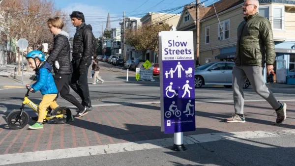
San Francisco Suspends Traffic Calming Amidst Record Deaths
Citing “a challenging fiscal landscape,” the city will cease the program on the heels of 42 traffic deaths, including 24 pedestrians.

Defunct Pittsburgh Power Plant to Become Residential Tower
A decommissioned steam heat plant will be redeveloped into almost 100 affordable housing units.

Trump Prompts Restructuring of Transportation Research Board in “Unprecedented Overreach”
The TRB has eliminated more than half of its committees including those focused on climate, equity, and cities.

Amtrak Rolls Out New Orleans to Alabama “Mardi Gras” Train
The new service will operate morning and evening departures between Mobile and New Orleans.
Urban Design for Planners 1: Software Tools
This six-course series explores essential urban design concepts using open source software and equips planners with the tools they need to participate fully in the urban design process.
Planning for Universal Design
Learn the tools for implementing Universal Design in planning regulations.
Heyer Gruel & Associates PA
JM Goldson LLC
Custer County Colorado
City of Camden Redevelopment Agency
City of Astoria
Transportation Research & Education Center (TREC) at Portland State University
Jefferson Parish Government
Camden Redevelopment Agency
City of Claremont