infographics
'Transit Insights' Updated With New Features for Visualizing Public Transit Data
One of the best tools for understanding the consequences and potential of transit planning has been recently updated.

Mapping the Land Uses of the United States
The McHarg Center's "The 2100 Project: An Atlas for the Green New Deal" provides a series of maps an infographics to illustrate the way the United States uses land.

Infographic: Space Allocation by Population in 15 U.S. Cities
A new infographic breaks down how much space is devoted to buildings, green space, and roads in 15 major U.S. cities.

Measuring Job Densification Trends in U.S. Metropolitan Areas
A new report details the trend of jobs densification in U.S. metropolitan areas between 2004 and 2015, finding a few large metropolitan areas leading an overall increase in jobs density. Still, many areas are seeing jobs disperse around the region.

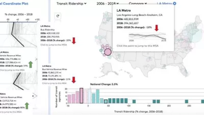
Compare Transit Ridership in U.S. Cities
A new interactive tool called Transit Insights offers access to the local trends of transit ridership.

Pop Quiz: Can You Identify Cities By Density Alone?
A Planetizen editor failed this quiz.

Visualizing Density in New Jersey
An interactive map shows the surprising density of the Garden State.
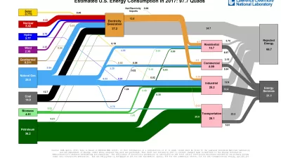
Infographic: Track the Flow of Energy in the United States
The Lawrence Livermore National Laboratory has a collection of infographics illustrating the use and waste of energy in the county and in specific states by year.
A Public Service Announcement to Explain Newfangled Bike Infrastructure
The Montgomery County Department of Transportation set up a website to explain the new rules of the multi-modal road.

Concerns About Census 2020, As Told by GIFs
Interested observers have been sounding the alarms about the federal government's readiness and commitment level for the 2020 Census.

Visualizing Transit Reliability (Or Not)
A new tool in Miami could use broader application in cities around the country (hint hint).

Mapping the LGBTQ-Friendliness of the World's Cities
A colorful data visualization tool maps information about which cities have the most protections for LGBTQ people in place. The tool is intended as a resource for LGBTQ travelers.

Comparing Transit Choice by City
What does the way transit commuters move say about their city?

How People Will See the Eclipse Today
A 33-year GIS professional lets loose his geospatial and population analysis skills on the occasion of a lifetime: today's "Great American Eclipse."
Friday Eye Candy: An Infographic for Every Transit Mode
Fans of public transit rejoice. A new infographic explores the rolling stock of most of the major cities in the United States and Canada.
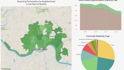
Who Recycles in Cincinnati?
A new CincyInsights dashboard shows recycling participation rates all over the city.

Friday Fun: All the Colors of the U.S. Transit Rainbow
An intrepid grad student at MIT created a graphic that shows off the color palettes of U.S. and Canadian transit lines.

Illustrating the State of Homelessness in the U.S.
Words and pictures haven't ended homelessness in the United States, but they can help people understand how widespread and deep the challenge is.

Poverty in the United States Explained
The Brookings Institution has provided a data-driven examination of the subject of poverty in the United States, to provide the kind of policy nuance and detail missing from the 2016 presidential campaign.
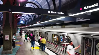
Infographic: Incomes Along Los Angeles Metro Lines
As Los Angeles weighs the merits of more major funding for Metro Rail projects, the current slate of new routes is already coming online. This graphic depicts median household incomes along existing and future rail lines.
Urban Design for Planners 1: Software Tools
This six-course series explores essential urban design concepts using open source software and equips planners with the tools they need to participate fully in the urban design process.
Planning for Universal Design
Learn the tools for implementing Universal Design in planning regulations.
Gallatin County Department of Planning & Community Development
Heyer Gruel & Associates PA
JM Goldson LLC
Mpact (founded as Rail~Volution)
City of Camden Redevelopment Agency
City of Astoria
Jefferson Parish Government
Camden Redevelopment Agency
City of Claremont