Visualizations
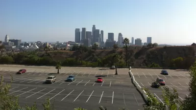
Every Parking Lot, Visualized
A car spends 95 percent of the time parked, and only 5 percent of its time in use. The huge amount of space that system requires is made "intuitively and accessibly" comparable by the What the Street project.
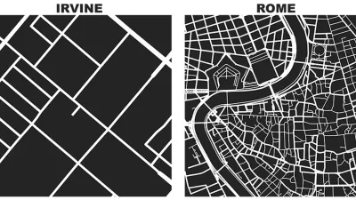
Friday Eye Candy: Comparing a Square Mile of the World's Famous Cities
Street networks and city blocks, reduced to their fundamental attributes, reveal the vast differences between cities.

Friday Eye Candy: Turning Gentrification Data Into Art
Herwig Scherabon is a graphic designer featured this week in The Guardian.

Friday Eye Candy: Watch as the Earth 'Breathes'
A new visualization from the Smithsonian's National Museum of Natural History shows how the earth "breathes"—in the form of volcanic eruptions, earthquakes, and emissions.

What 6,000 Years of Population Data Looks Like
We can now watch 6,000 years of urban settlements and movements unfold on our computer screens.
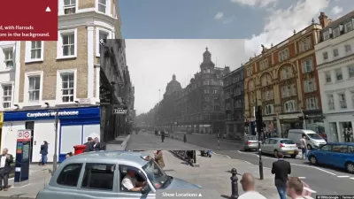
Friday Eye Candy: Historic London Visualized
Historic London collects panoramic views of modern London streets with historic photos transposed over them. Most of the views date from the first two decades of the 20th century.

400 Years of Single-Family Homes in America
A data visualization project illustrates the long and varied traditions of American single-family housing.

An Animation of the World's Transit Systems
"A German university student has developed a fun new tool for visualizing public transit in a more system-oriented way," according to a post by Sam Sturgis.
Visualizing the Spread of the OpenStreetMap Project
OpenStreetMap has released an animated map to illustrate the impressive growth of the project over the first ten years of its existence.
How Images Shape our Understanding of Places
An article by Ben Campkin, Marina Mogilevich, and Rebecca Ross examines how images shape ideas about cities—from "John Snow’s Cholera map to Le Corbusier's plan for a contemporary city and Moose's 'clean graffiti.'"
Friday Eye Candy: A Colorful Weather Visualization for Urban Weather
Part infographic and part diary, the weather radials project tracks the weather for every day in 2013.
How Apps Can Help Track How Angelenos Move
In a review of the iPhone app Human, Los Angeles County planner Clement Lau examines how the daily movement of residents can be measured.

40 Visualizations of America and its Relationship with Food
A new post by Vox includes 40 maps, charts, and graphs explain that where and how food works in America.

Watch D.C.'s Surface Parking Lots and Unoccupied Buildings Disappear
The Downtown D.C. Business Improvement District recently released its State of Downtown report. Downtown D.C.'s transformation over the last two decades has created an incredible revenue generator for the city.
Examining the Surprising Segregation of New York City
The common perception of New York City is as of a well-integrated city, full of multi-ethnic neighborhoods. But a recent article peeks behind the curtain of the city’s surprising boundaries of racial segregation.
Tracking Chicago’s Potholes
A new animated map presents the reported cases of potholes in Chicago since November—the maps colorful and provides insights into how the city, and our relationship to it, can change with time.
Graphic Reveals Cardinal Orientation of Street Grids
Seth Kadish says he was born with an innate sense of direction. As such, he appreciates street grids oriented to cardinal directions. The phenomena interested him enough to create a graphic that visualizes the orientation of 12 urban areas.
Friday Eye Candy: 19 Fascinating City Maps
Lauren Drell at Mashable has rounded up 19 (or is it 21?) 'dynamic, real-time and compelling visualizations of how we live and move.'
Urban Design for Planners 1: Software Tools
This six-course series explores essential urban design concepts using open source software and equips planners with the tools they need to participate fully in the urban design process.
Planning for Universal Design
Learn the tools for implementing Universal Design in planning regulations.
planning NEXT
Appalachian Highlands Housing Partners
Mpact (founded as Rail~Volution)
City of Camden Redevelopment Agency
City of Astoria
City of Portland
City of Laramie