data visualization

How Cities Can Leverage Financial Data for Smarter Urban Planning
Explore how cities can use financial data to enhance urban planning, improve budget allocation, and boost community services.

The Growing Importance of Data Storytelling
Data storytelling refers to the ability to effectively communicate insights from data using narratives and visualizations. When done right, it can be used to put data insights into context and inspire action from decisionmakers.

The Importance of Good Data Visualization
When done right, data visualization effectively translates complex data into easily understood visuals in the form of graphs, charts, maps, plots, animations, and more.
Esri App Makes Data Visualization Easy
A wealth of pre-authored policy maps lets users access data to explore public policy issues.
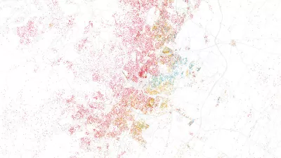
What’s the Life Expectancy in Your Neighborhood?
To create a tool for people better understand their cities and communities, Quartz mapped life expectancy in cities down to the census tract levels.

As Temperatures Increase, Maps Show Sea-Level Rise Will Devastate Cities
Data visualizations illustrate the catastrophic consequences of single-digit global temperature increases.
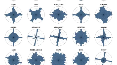
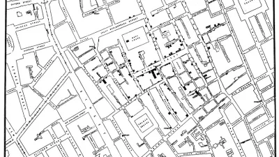
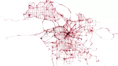
Chart Your City's Street Network to Understand its Logic
The roads in your city might conform to a grid, or they might divert around natural resources or landmarks. A new tool aims to help you visualize the "hidden logic" behind urban growth.

Mapping All the Land Uses in the Lower 48
A massive data visualization project illuminates the land uses that define the United States.
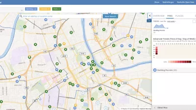
Presenting Municipal Data in an Interactive Map, Nashville Style
The city of Nashville launched the NashView interactive data map earlier this month.

Metrorail Travel Patterns Revealed
Commute data for one of the nation's premier rail transit systems, revealed.

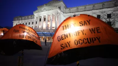
Who's Mapping Gentrification, and Where?
In these cities, data on gentrification has been compiled to build mapping tools documenting the process. The hope is to identify neighborhoods where low-income residents are at risk of displacement.

Mapping to Explain Homelessness in the U.S.
A team at Sasaki has created the "Understanding Homelessness" website, full of interactive features and one particularly helpful data visualization.
Visualizing Gentrification in 9 Cities
A new atlas explores the multiple causes of gentrification through bold graphics and data visualizations.

DataUSA: An Intuitive Tool for Public Data
A collaboration between Deloitte, Datawheel, and MIT has produced an intuitive aesthetically-pleasing gathering point for public data in the United States. Specific locations and industries boast easy-to-read profiles.
Visualizing Parking in the City of Brotherly Love: Parkadelphia
An intrepid city employee created Philadelphia's first mapping tool for visualizing the layers of regulation and management that govern when, when, and how people park in Philadelphia.
Los Angeles Debuts Open Data Visualization Tool
Containing more than 500 open datasets, GeoHub lets users access the wealth of data Los Angeles makes available. The tool is also intended to help employees from different city departments work together.

Visualizing Global Urban Growth Through 2030
Geographer Duncan Smith mapped the predicted trajectory of worldwide urban growth from 1950 through 2030. Concentric circles of different shades show where and when growth was (or will be) the most dramatic.
'ManyCities' Uses Mobile Phone Data to Visualize Human Activity
A new online visualization tool makes it easier to read and understand data about mobile phone usage in four cities around the world, including Los Angeles and New York.

400 Years of Single-Family Homes in America
A data visualization project illustrates the long and varied traditions of American single-family housing.

Mapping the Age of Every Building in Los Angeles
Developed using open data from local government sources, built: LA is a mapping tool that displays the age of every building in the county. Much of the area's built environment is surprisingly old.
Urban Design for Planners 1: Software Tools
This six-course series explores essential urban design concepts using open source software and equips planners with the tools they need to participate fully in the urban design process.
Planning for Universal Design
Learn the tools for implementing Universal Design in planning regulations.
Gallatin County Department of Planning & Community Development
Heyer Gruel & Associates PA
JM Goldson LLC
City of Camden Redevelopment Agency
City of Astoria
Transportation Research & Education Center (TREC) at Portland State University
Jefferson Parish Government
Camden Redevelopment Agency
City of Claremont