


A new map from Mapbox visualizes traffic on all roads eligible for highway safety funds by combining data available through the Highway Performance Monitoring System on OpenStreetMap.

Eric Fischer shares news of a new map project by Mapbox, which displays the latest Highway Performance Monitoring System (HPMS) national highway dataset on OpenStreetMap. What results is a highly readable map showing traffic intensity for roads all over the country, as measured by average vehicles per day.
Fischer provides a bit of background on the dataset used to populate the map: "The dataset has been open and available since the August, 2012 requirement for all states to annually report a measured spatial file of all public roads. The files available for download are limited to the highways that are part of the Federal Aid program (basically, local roads are not included)."
Fischer also assessed the final product as follows: "You can see that the geographical alignment between the two datasets is on par. The coverage of OpenStreetMap is better, but full road coverage is not the goal of HPMS. We've visualized the traffic density attribute in HPMS as line thickness to highlight the regional and national significance of different roads. Thicker yellow lines are more traffic and thinner yellow lines are less traffic. Zoom in to see the numbers for average vehicles per day."
FULL STORY: What OpenStreetMap can learn from HPMS, the open US highway dataset

Visualizing the Spread of the OpenStreetMap Project
OpenStreetMap has released an animated map to illustrate the impressive growth of the project over the first ten years of its existence.
Ten Years of OpenStreetMap
Exactly how does a student take on an open data political stance and transform it into "the largest crowd-sourced mapping project on the internet"?

Bikeshare for the Win: Team Pedals to London Cricket Match, Beats Rivals Stuck in Traffic
While their opponents sat in gridlock, England's national cricket team hopped Lime bikes, riding to a 3-0 victory.

Planetizen Federal Action Tracker
A weekly monitor of how Trump’s orders and actions are impacting planners and planning in America.

Maui's Vacation Rental Debate Turns Ugly
Verbal attacks, misinformation campaigns and fistfights plague a high-stakes debate to convert thousands of vacation rentals into long-term housing.
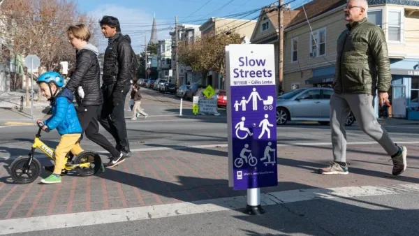
San Francisco Suspends Traffic Calming Amidst Record Deaths
Citing “a challenging fiscal landscape,” the city will cease the program on the heels of 42 traffic deaths, including 24 pedestrians.

Amtrak Rolls Out New Orleans to Alabama “Mardi Gras” Train
The new service will operate morning and evening departures between Mobile and New Orleans.

The Subversive Car-Free Guide to Trump's Great American Road Trip
Car-free ways to access Chicagoland’s best tourist attractions.

San Antonio and Austin are Fusing Into one Massive Megaregion
The region spanning the two central Texas cities is growing fast, posing challenges for local infrastructure and water supplies.
Urban Design for Planners 1: Software Tools
This six-course series explores essential urban design concepts using open source software and equips planners with the tools they need to participate fully in the urban design process.
Planning for Universal Design
Learn the tools for implementing Universal Design in planning regulations.
Heyer Gruel & Associates PA
JM Goldson LLC
Custer County Colorado
City of Camden Redevelopment Agency
City of Astoria
Transportation Research & Education Center (TREC) at Portland State University
Jefferson Parish Government
Camden Redevelopment Agency
City of Claremont