


What is the relationship between car travel and health outcomes in the United States? Ariel Godwin and Anne Price challenge the claim that more time in the car decreases your health by looking at the impacts of education, income, and employment rates.
A Planetizen feature article in October 2011 discussed the relationship between health and car travel, and warned against the incautious use of statistics in interpreting this relationship. While correlations can be seen between higher rates of car travel and lower average healthy life expectancy at the national level, attributing causality to car travel is much more difficult. As Grammenos points out, a number of confounding factors may be at work.
Similar problems in attributing health outcomes to car travel exist at the local level within the United States. Here, we examine visually, through a series of maps, the association between obesity, diabetes, and sedentary transportation. We also map other key factors, namely median household income, poverty, educational attainment, and unemployment rates. In doing so, we contribute to a general understanding of how consistently these factors do (or do not) correlate regionally in the U.S. The hope is that these visual presentations will encourage further empirical work examining the relationship between car travel and health outcomes, while accounting for possible supplementary factors.
The analysis is restricted to the United States, and is at the county (or county-equivalent) level, since that is the smallest geographic level at which data are readily available for the entire nation. The color-coding in our maps divides the counties into quintiles, meaning that in each map, 20 percent of the counties are red, 20 percent are orange, and so on.
Some caveats regarding the data: The commuting statistics (for workers aged 16 or older) are from the Census Bureau's 2005-2009 five-year American Community Survey estimates, since that is the most recent timeframe for which data are currently available covering all counties in the U.S. and reporting bicycling as a separate mode all on its own. The data are not for all trips, but only journeys to work. The obesity and diabetes statistics (for adults aged 20 and older) are from the CDC's Behavioral Risk Factor Surveillance System, and are estimates from 2008, the most recent year available.
The first two maps show the prevalence of obesity and diabetes in the United States:
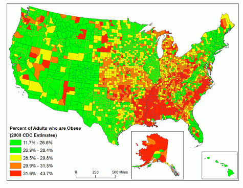
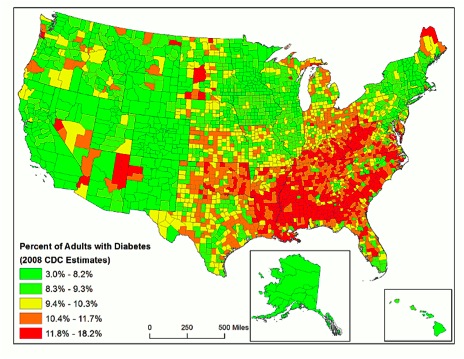
Note the similar patterns in the two maps, showing high rates of obesity and diabetes in the southeastern U.S. The second map shows what public health professionals have recently termed the "diabetes belt," stretching from Appalachia into the deep South. A few counties in Michigan also have higher rates, as well as some regions in the West. Alaska, with high obesity rates but lower rates of diabetes, is an outlier.
There are multiple demographic differences between those living within and outside the diabetes belt. Counties in the diabetes belt tend to have lower levels of economic development (indicative of less access to health care), a greater prevalence of obesity and a sedentary lifestyle, and less college education. The diabetes belt has a higher proportion of African Americans and a lower proportion of people of Hispanic ethnicity than the rest of the nation (Barker et al. 2011). Importantly, research shows that one-third of the excess risk in the diabetes belt can be attributed to obesity and sedentary lifestyle, which are modifiable factors (Barker et al. 2011).
The next two maps examine commute modes, with the first presenting the percentage of commuters that travel by car, truck, or van, including those who carpool. It does not include transit use, which typically involves some walking, and is therefore not so sedentary.
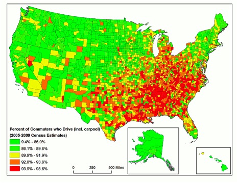
Although this map does not look exactly the same as the obesity and diabetes maps, there are some striking similarities. Throughout the Appalachians and the deep South, there is a pattern that we could call the "non-active transportation belt," where the percentages of commuters who drive are highest. It covers a similar area to the "diabetes belt," but also extends somewhat into Indiana, Ohio, and Michigan. Considering that one-third of the higher diabetes risk associated with living in the diabetes belt can be attributed to the modifiable risk factors of sedentary lifestyle and obesity, this map certainly suggests that commute mode may play an important part in the existence of the diabetes belt.
The next map shows where commuters walk and bike the most. In this map, the colors are reversed, with green signifying higher biking/walking rates. In almost all counties in the U.S., this is a very small proportion of the commuting population; note that the top quintile begins at 5.5 percent.
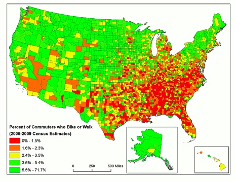
As one might expect, this map looks similar to the map depicting the car/truck/van mode share. For reasons that we can speculate about (such as climate, availability of public transport, individual economics, and a cyclical relationship between obesity and commute mode), biking and walking are less utilized for commuting in Appalachia and the deep South, and are more utilized in the northern U.S., including Alaska.
Of course, none of this shows any direct causal link between commute modes and obesity/diabetes rates. But looking at the maps, it's hard to deny that there is a pattern. However, considering that biking and walking make up such a small percentage of total commute mode in the U.S. (the first four quintiles make up only 5% of the population) it seems unlikely that active transportation plays any major role in explaining differences in obesity and diabetes in the U.S.
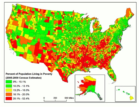
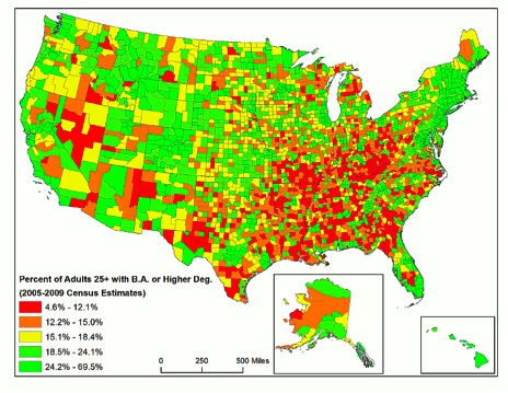
Regional variation in income is known to influence obesity and diabetes rates (Barker et al. 2011), so the next step in our examination was to look at how closely these factors mirror the obesity and diabetes patterns. Mapping these factors shows that income and education are fairly regionally correlated. The geographic pattern is not quite the same for either, nor do they exactly match the obesity and diabetes maps, but again, the deep South and Appalachia stand out.
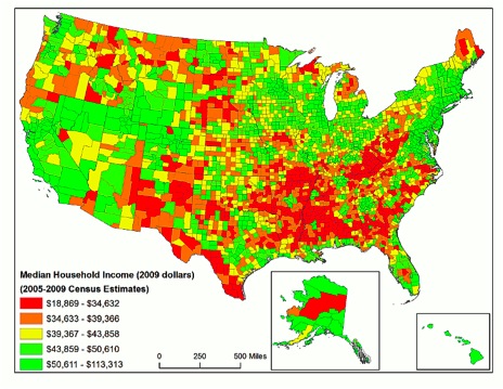
Poverty shows roughly the same pattern as median household income:
Educational attainment also contributes to explaining national variation in obesity and diabetes rates; the next map shows educational attainment by adults aged 25 and older. Again, the southeastern United States is overrepresented in terms of counties with a high proportion of individuals without a B.A. degree, but the pattern does not replicate the obesity and diabetes trends.
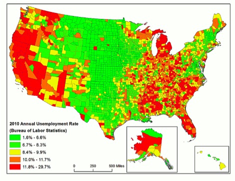
How about unemployment? Individuals in counties with high unemployment may have less access to healthcare, which may affect diabetes rates either by leading to a higher prevalence, or alternatively, to a lower prevalence, due to fewer diagnosed cases. In the map below, it's clear that the deep South and Appalachia are troubled, but otherwise the pattern is quite different from the obesity/commuting patterns, with Michigan and the West Coast states standing out.
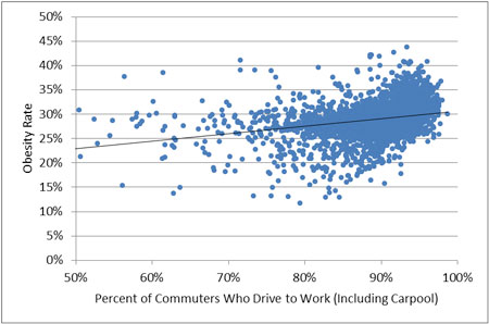
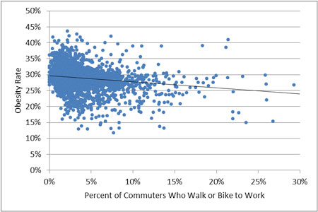
The two scatterplots below show the relationship between obesity rates and commuting habits, with each dot representing a county or county-equivalent. The first chart omits extreme outliers with very high rates of walking and biking (almost all of which are in Alaska, which has many factors that set it apart, including population density, demographics, and employment patterns). The second chart omits outliers with very low rates of driving, all in Alaska and the New York City metro area. (Supplemental analyses of the relationship between obesity rates and commuting habits in Alaska are available from the authors upon request.) The plots show a strong relationship between commuting habits and obesity rates. Considering that the percentage of active commuters in the U.S. is quite small, it is unlikely that walking and biking make any significant contribution to reducing the obesity rate in particular counties. More likely, counties with the highest percentage of walkers and cyclists also share other common characteristics that are driving this trend. Perhaps lower rates are driven by a cumulative effect of a more affluent and educated population. It may also be that counties with higher rates of active commuting have policies and cultures that have led to higher rates of physical activity overall.
Conclusions
As the Oct. 2011 article pointed out, the relationship between sedentary travel and health outcomes can be misleading when additional contributing factors are not taken into account. While it is not our intent to claim a direct causal link between transportation modes and obesity rates, it is hard to deny the existence of some geographic patterns.
The next avenue of study would be to determine how much of this pattern is actually attributable to transportation mode, versus the other factors we explored here, such as education and income, which are known to be key causal factors in health outcomes. Numerous other factors may have a cumulatively significant effect.
In addition to commute mode, these geographic patterns might be explained in part by factors such as:
- food choices
- sedentary hobbies
- stress
- unemployment rates
- regional culture
Thus, there is much potential for research that examines the mechanisms underlying these regional associations.
Finally, we'd like to note that as important as it is to be careful in drawing a direct link between commute modes and health, it is just as important to avoid hastily drawing conclusions about the reasons why commute modes vary across the U.S. Often commute modes are described as being "choices" in blogs and academic journals, or individuals are described as "favoring" one type of transport over another.
Just as there is more to the story of obesity than just car travel, there are a multitude of reasons why individuals in various regions end up in their cars, from differences in walkability of neighborhoods and availability of public transportation to climate and the need to chauffeur children. Commute modes should not be interpreted as "choices" unless we can be sure that's what they represent.
Ariel Godwin is a planner and research analyst at the Central Florida Regional Planning Council in Bartow, FL. He has also worked as a transportation planner at the Boston MPO and at the Mid-Ohio Regional Planning Commission, where he focused on active transportation and helped to develop a Complete Streets policy. Prior to that he was a freelance translator. He holds a master's degree in city and regional planning from Ohio State University.
Anne Price is Visiting Assistant Professor of Sociology at University of South Florida Polytechnic. Her teaching and research specializations are in cross-national sociology and methodology, with a particular focus on women's health and status. Recent publications include articles in the International Journal of Sociology and Sociological Spectrum. She holds a Ph.D. in Sociology from Ohio State University.
Sources
Barker, Lawrence E., Karen A. Kirtland, Edward W. Gregg, Linda S. Geiss, Theodore J. Thompson. 2011. "Geographic Distribution of Diagnosed Diabetes in the U.S.: A Diabetes Belt." American Journal of Preventive Medicine 40(4): 434-439.
Centers for Disease Control and Prevention. 2008 county level estimates of obesity and diabetes. http://apps.nccd.cdc.gov/DDT_STRS2/NationalDiabetesPrevalenceEstimates.aspx (last accessed Nov. 17, 2010).
Centers for Disease Control and Prevention. "CDC Identifies Diabetes Belt." http://www.cdc.gov/diabetes/news/docs/diabetes_belt.htm (last accessed Nov. 17, 2010).
U.S. Census Bureau. 2005-2009 American Community Survey 5-Year Estimates. http://factfinder.census.gov/servlet/DatasetMainPageServlet?_program=ACS&_submenuId=&_lang=en&_ts= (last accessed Nov. 17, 2010).
U.S. Census Bureau. 2010 Census data. http://factfinder2.census.gov/faces/nav/jsf/pages/index.xhtml (last accessed Nov. 17, 2010).


The Shifting Demographics of Covid-19
For most of the Covid-19 pandemic, Black Americans died at much higher rates than White Americans. That trend has reversed at times during the past year.

Where Mass Shootings Happen
It's tempting to try to find a link between sites of mass shootings, but data shows they happen in all types of American communities.

Are Teens Tired of Commuting?
Carole Turley Voulgaris guest blogs about a recent article in the Journal of Planning Education and Research.

Planetizen Federal Action Tracker
A weekly monitor of how Trump’s orders and actions are impacting planners and planning in America.

Maui's Vacation Rental Debate Turns Ugly
Verbal attacks, misinformation campaigns and fistfights plague a high-stakes debate to convert thousands of vacation rentals into long-term housing.

Restaurant Patios Were a Pandemic Win — Why Were They so Hard to Keep?
Social distancing requirements and changes in travel patterns prompted cities to pilot new uses for street and sidewalk space. Then it got complicated.

In California Battle of Housing vs. Environment, Housing Just Won
A new state law significantly limits the power of CEQA, an environmental review law that served as a powerful tool for blocking new development.

Boulder Eliminates Parking Minimums Citywide
Officials estimate the cost of building a single underground parking space at up to $100,000.

Orange County, Florida Adopts Largest US “Sprawl Repair” Code
The ‘Orange Code’ seeks to rectify decades of sprawl-inducing, car-oriented development.
Urban Design for Planners 1: Software Tools
This six-course series explores essential urban design concepts using open source software and equips planners with the tools they need to participate fully in the urban design process.
Planning for Universal Design
Learn the tools for implementing Universal Design in planning regulations.
Heyer Gruel & Associates PA
JM Goldson LLC
Custer County Colorado
City of Camden Redevelopment Agency
City of Astoria
Transportation Research & Education Center (TREC) at Portland State University
Jefferson Parish Government
Camden Redevelopment Agency
City of Claremont