Forget red state versus blue state: a new data analysis and mapping project by The New York Times shows that the political divides in the country can be mapped to the neighborhood level within metropolitan areas.



Emily Badger, Kevin Quealy, and Josh Katz present an info-graphic-rich data journalism feature that reveals the partisan divides evident in the geography of the United States—in far greater detail than the red-blue and urban-rural divide that is already searingly rendered on so many elections maps. The big surprise of this exercise: the partisan dive of U.S. communities is visible at the local level, within urban areas.
"Democrats and Republicans live apart from each other, down to the neighborhood, to a degree that raises provocative questions about how closely lifestyle preferences have become aligned with politics and how even neighbors may influence one another," according to the article.
The analysis is made possible by analyzing the individual addresses for 180 million registered voters. The data reveals that "nearly all American voters live in communities where they are less likely to encounter people with opposing politics than we’d expect."
Maps of Los Angeles, Chicago, Dallas, and New York top the article, but the same patterns are visible in Atlanta, Baltimore, Austin, Indianapolis, Boston, Cincinnati, Charlotte, Detroit, Birmingham, Columbus, Denver, Houston, and more.
As for what explains these patterns, the article suggest that geographic alignment follows educational realignment,"with the changes concentrated in highly educated suburbs and more working-class towns and rural communities." Racial segregation also plays a factor in partisan clustering, according to the article. "African-American voters in particular are overwhelmingly Democratic and also residentially segregated (metro Milwaukee’s map of partisan segregation, for one, resembles its map of racial segregation)."
A lot more analysis on both cause and effect is included in the source article.
FULL STORY: A Close-Up Picture of Partisan Segregation, Among 180 Million Voters

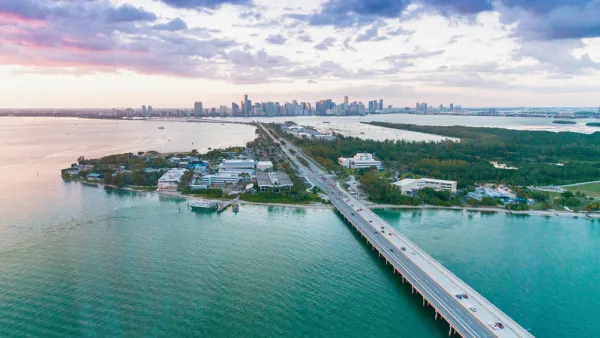
The Great American Exodus: A Conservative's Perspective
During his keynote speech on September 11 at the National Conservatism Conference in Miami, Florida Governor Ron DeSantis describes the demographic shifts in America since he became governor in 2019 in what he calls the 'Great American Exodus.'
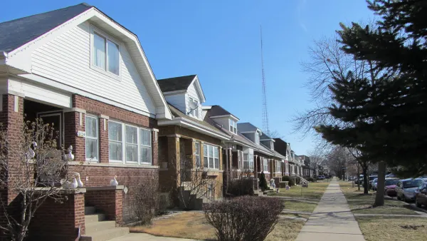
Mapped: Chicago's Shrinking Middle Class
In 1970, half of the city's census tracts were middle-income. Now, only 16 percent of them remain so. Polarization between the well-off and the poor essentially splits the city in two.
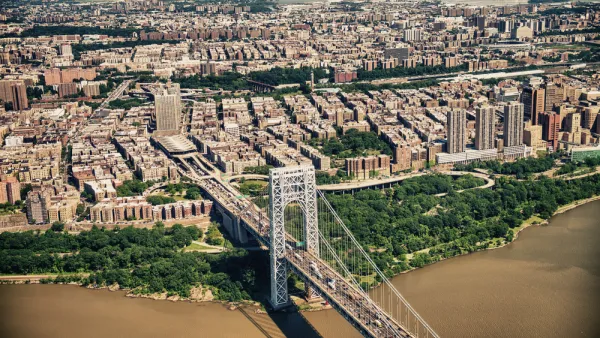
Conservatives Have a Bad Feeling About Smart Growth
Bloggers, pundits, authors, and researchers, have made the case for conservatives to embrace the effects of smart growth. Yet still, a distinctly partisan divide flavors the debate about how to make room for a growing number of Americans.

The state-sanctioned urbicide of Austin
People don’t kill cities. Freeways do.

US to reduce Colorado River water deliveries to Mexico
A new Colorado Treaty amendment reduces Mexico’s Colorado River water allocation by 250,000 acre feet.
New Jersey’s second-largest city bans standalone data centers
Jersey City will continue to allow co-location facilities, such as those meant for research institutions that store their own data.

Amtrak not solely to blame for New Jersey commuter rail's unreliability, report finds
A new study from the Garden State Initiative found that NJ Transit’s budget grew 20% across a 4 year period, but reliability declined significantly over the same period.

EPA erases limits on planet-warming pollution from power plants
Under Monday’s plan, power plants would still have some limits on how much mercury, arsenic and other contaminants they can emit.

Phoenix announces new on-demand transit service, more frequent RAPID buses
Both new services will launch in October, and are part of Phoenix's Project Effective Access Solutions for Easing Congestion.

FREE Course: Walkable City 1: Why Walkability?
After describing his path towards focusing on walkability as the essence of good planning, Jeff Speck marches through his five principal reasons for making more walkable places.
Reinventing Malls: Planning Alchemy—Turning Gray Fields Into Gold
The course focuses on the opportunities and imperatives that shape reinvention of mall sites.

Eagle County Government
Harvard University Graduate School of Design
Nashville Planning Department
The Architects Foundation
University of Cincinnati Online
The Pocatello Development Authority
The Urban Renewal Agency of the City of Pocatello
Journal of the American Planning Association