


A pair of interactive maps and a report compare access to opportunity in two very different neighborhoods. In both places, residents confront "friction of distance" and feel their input on public decision-making is limited.

Rachel Kaufman covers a pair of interactive maps and a report from the UNC Center for Community Capital and JPMorgan Chase that tease out the "zip code effect" on access to economic opportunity. "The purpose of the report, as its authors said, was to 'shed light on which aspects of access to opportunity are universal — i.e. seem to be present regardless of setting — and which are more a matter of local particularities.'"
The project looks at two neighborhoods, Columbia Parc in New Orleans, and Protrero Terrace and Annex in San Francisco, with very divergent socio-economic contexts. Despite the latter's position in a wealthy area, Kaufman writes, "residents still struggle: no bus line serves Protrero Annex, and the lines serving the Terrace have been cut over time. The nearest bank and credit union branches are more than a mile away, so residents end up using local ATMs (and paying the associated fees) or check-cashing stores."
Residents of Columbia Parc face similar challenges. One lesson: the "friction of distance" that residents perceive between two points matters more than the distance in miles. And without adequate information and awareness, social networks, and cultural competency from service providers, even neighborhoods in wealthy regions can become isolated from economic drivers and political processes that affect them.
FULL STORY: New Maps Show Access to Opportunity Isn’t Just Physical


San Francisco's School District Spent $105M To Build Affordable Housing for Teachers — And That's Just the Beginning
SFUSD joins a growing list of school districts using their land holdings to address housing affordability challenges faced by their own employees.

How a Government-Sponsored Enterprise Turned Away From its Housing Mission
A coalition of housing advocates is calling on the Federal Home Loan Bank system to return to its original purpose — lending to support housing.

San Francisco Aims to Speed up Supportive Housing Placement
The city wants to expedite the process for getting people into available housing units.

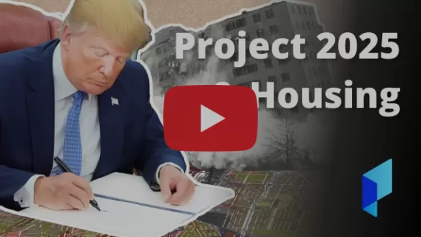
Planetizen Federal Action Tracker
A weekly monitor of how Trump’s orders and actions are impacting planners and planning in America.

Chicago’s Ghost Rails
Just beneath the surface of the modern city lie the remnants of its expansive early 20th-century streetcar system.

Amtrak Cutting Jobs, Funding to High-Speed Rail
The agency plans to cut 10 percent of its workforce and has confirmed it will not fund new high-speed rail projects.

Ohio Forces Data Centers to Prepay for Power
Utilities are calling on states to hold data center operators responsible for new energy demands to prevent leaving consumers on the hook for their bills.

MARTA CEO Steps Down Amid Citizenship Concerns
MARTA’s board announced Thursday that its chief, who is from Canada, is resigning due to questions about his immigration status.

Silicon Valley ‘Bike Superhighway’ Awarded $14M State Grant
A Caltrans grant brings the 10-mile Central Bikeway project connecting Santa Clara and East San Jose closer to fruition.
Urban Design for Planners 1: Software Tools
This six-course series explores essential urban design concepts using open source software and equips planners with the tools they need to participate fully in the urban design process.
Planning for Universal Design
Learn the tools for implementing Universal Design in planning regulations.
Caltrans
City of Fort Worth
Mpact (founded as Rail~Volution)
City of Camden Redevelopment Agency
City of Astoria
City of Portland
City of Laramie