


The 2015 Inrix Traffic Scorecard provides less useful information about traffic problems than previous editions, as discussed in this City Observatory Commentary.
On March 15, traffic data firm Inrix released its 2015 Traffic Scorecard, ranking travel delays in the largest cities in Europe and North America. As is customary for the genre, it was trumpeted with a press release bemoaning the billions of hours that we waste in traffic. But a close look at the content of this year's report shows that on many levels, this year’'s scorecard is an extraordinary disappointment.
As impressive as the Inrix technology and data are, they're only useful if they provide a clear and consistent basis for comparison. Are things measured in the same way in each city? Is one year's data comparable with another? We and others have pointed out that the travel time index that serves as the core of the Inrix estimates is inherently biased against compact metropolitan areas with shorter travel distances, and creates the mistaken impression that travel burdens are less in sprawling, car-dependent metros with long commutes.
They reported monthly data, on a comparable basis, using a nifty Tableau-based front end that let users track data for particular markets over time. You could see whether traffic was increasing or decreasing, and how your market stacked up against other cities. All this has simply been disappeared from the Inrix website—though you can still find it, with data through the middle of 2014, on an archived Tableau Webpage.

This year's report is simply a snapshot of 2015 data. There's nothing from 2014, or earlier. It chiefly covers the top ten cities, and provides a drill down format that identifies the worst bottlenecks in cities around the nation. It provides no prior year data that let observers tell whether traffic levels are better or worse than the year before. In addition, the description of the methodology is sufficiently vague that it's impossible to tell whether this year’s estimates are in fact comparable to one's that Inrix published last year.
Our report card on Inrix
Here's the note that we would write to Inrix’s parents to explain the "D" we’ve assigned to Inrix's Report Card.
Inrix is a bright, promising student. He shows tremendous aptitude for the subject, but isn't applying himself. He needs to show his work, being careful and thorough, rather than excitedly jumping to conclusions. Right now he's a little bit more interested in showing off and drawing attention to his cleverness than in working out the correct answer to complicated problems. We're confident that when he shows a little more self-discipline, scholarship, and objectivity—and learns to play well with others—he'll be able to be a big success.
FULL STORY: Why the new Inrix Traffic Scorecard deserves a “D”

Private Cellphone Data and the Next Frontier of Urban Planning
A survey of the quickly broadening reach of data about the movement of traffic reveals the next step necessary to achieve congestion nirvana: unfettered access to private cell phone data.

Judge Extends NYC Congestion Pricing Through at Least June 9
A federal judge halted the Trump administration’s effort to kill the program, which remains in limbo as a lawsuit filed by the MTA moves forward.

NYC Congestion Pricing Continues to Show Positive Results
While the Trump administration attempts to revoke the program’s federal approval, congestion pricing continues to reduce traffic, speed up bus travel times, and improve air quality in Manhattan.

Planetizen Federal Action Tracker
A weekly monitor of how Trump’s orders and actions are impacting planners and planning in America.

Maui's Vacation Rental Debate Turns Ugly
Verbal attacks, misinformation campaigns and fistfights plague a high-stakes debate to convert thousands of vacation rentals into long-term housing.
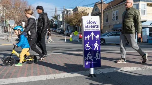
San Francisco Suspends Traffic Calming Amidst Record Deaths
Citing “a challenging fiscal landscape,” the city will cease the program on the heels of 42 traffic deaths, including 24 pedestrians.

Defunct Pittsburgh Power Plant to Become Residential Tower
A decommissioned steam heat plant will be redeveloped into almost 100 affordable housing units.

Trump Prompts Restructuring of Transportation Research Board in “Unprecedented Overreach”
The TRB has eliminated more than half of its committees including those focused on climate, equity, and cities.

Amtrak Rolls Out New Orleans to Alabama “Mardi Gras” Train
The new service will operate morning and evening departures between Mobile and New Orleans.
Urban Design for Planners 1: Software Tools
This six-course series explores essential urban design concepts using open source software and equips planners with the tools they need to participate fully in the urban design process.
Planning for Universal Design
Learn the tools for implementing Universal Design in planning regulations.
Heyer Gruel & Associates PA
JM Goldson LLC
Custer County Colorado
City of Camden Redevelopment Agency
City of Astoria
Transportation Research & Education Center (TREC) at Portland State University
Jefferson Parish Government
Camden Redevelopment Agency
City of Claremont