For decades we have blamed 100-year-old maps for the patterns of spatial racial inequity that persist in American cities today. An esteemed researcher says: we’ve got it all wrong.

Editor’s note: This story was originally co-published on August 21, 2024 with Shelterforce, an independent, non-academic publication covering the worlds of affordable housing, community development, and housing justice.
The research presented in this piece provides such powerful new context and nuance to the critical dialogue around equity in cities today that Planetizen adapted the article into a short documentary. This article was updated on May 15, 2025 to include the video.
Few people concerned with racial equality and the effects of racism on American cities are not familiar with the maps created by the Home Owners’ Loan Corporation (HOLC) in the late 1930s. In recent years, those maps have been repeatedly singled out as a major, or even the major driving force behind today’s patterns of urban racial inequity, whether measured in terms of housing quality, environmental conditions, or health disparities. Nearly a hundred academic papers, and even more media articles, blogs, commentaries, and lesson guides have pointed to the maps as the roots of conditions as varied as abandoned housing, diabetes incidence, and lack of tree cover. But is this story true? What role, if any, did the maps actually play?
A closer look tells a very different story. But to tell that story, a little background is needed.
The HOLC and its maps
The Home Owners’ Loan Corporation was created in 1933 as a New Deal response to the greatest foreclosure crisis the United States had ever seen. The HOLC bought distressed home mortgage loans from banks and borrowed money from the U.S. Treasury to restructure the loans so the homeowners could stay in their homes. From June 1933 to June 1936, when the HOLC’s authority to make loans sunsetted, it refinanced roughly 1 million mortgages, or nearly one of every five existing nonfarm mortgages in the United States. The HOLC did not make mortgages to new homebuyers.
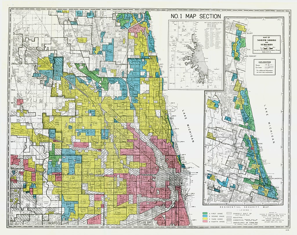
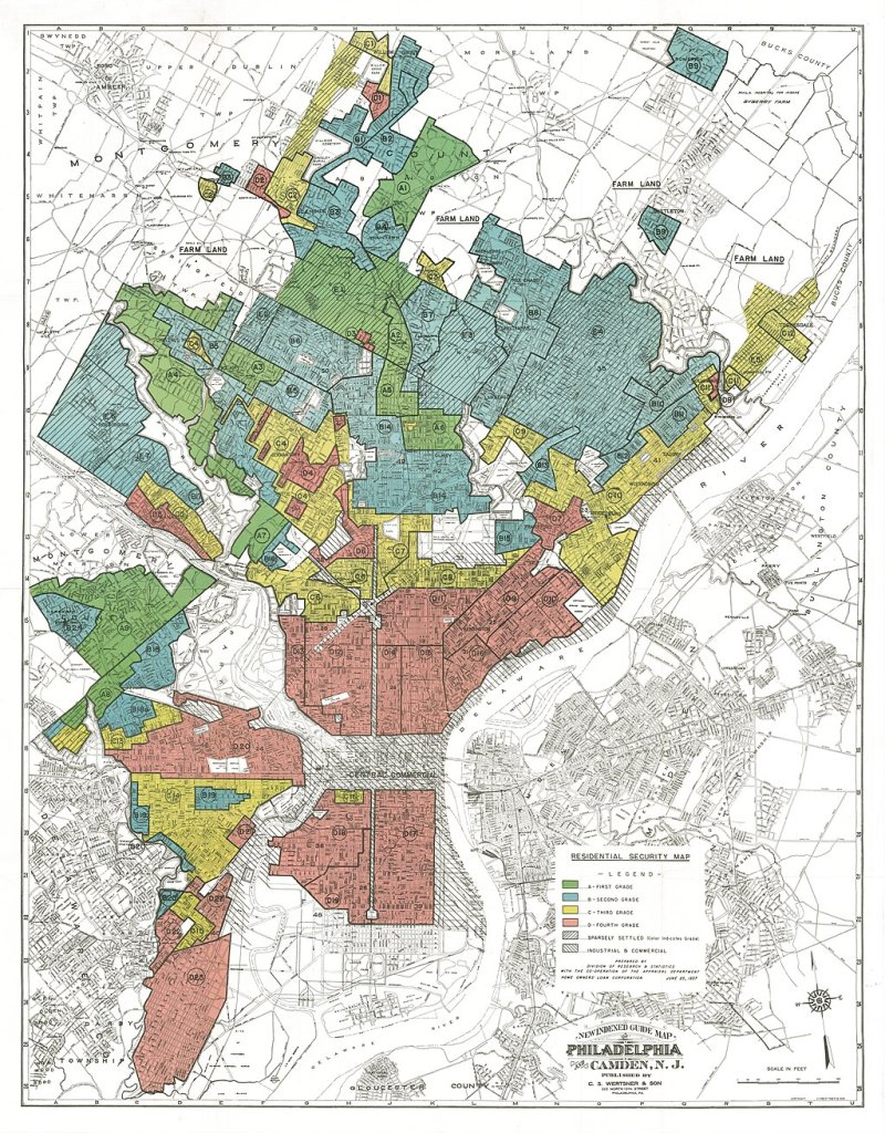
At the end of 1935, the HOLC began to hire local real estate professionals to make what it called “residential security” maps of their cities. Each city was divided into many small areas, which were then evaluated for housing, environmental, social, and economic conditions. Each area was classified as A (best, or green), B (blue), C (yellow), or D (worst, or red).
The D areas are the ones that have come in recent years to be known as redlined. While the surveyors mostly focused on physical and environmental conditions, which they usually documented in detail, they were also notoriously told to consider the presence or “invasion” of “negro, foreign-born or lower grade” residents. The maps they prepared between 1936 and 1940 were shared with the FHA but not with private lenders.
Many people believe that the term redlining originated with those maps, based on the fact that the D areas were colored red. In actuality, the term was coined by community activists in Chicago in the late 1960s. While today “redlining” has come to be used to describe any pattern of denying loans or other resources to areas because of their racial or ethnic characteristics, it was only linked to the HOLC maps many decades after they were made.
How were the maps used?
Nobody knows exactly why the HOLC commissioned the maps. By the time the first maps were made, the HOLC was almost completely out of the lending business. Moreover, during the three
years the HOLC bought mortgages and made loans, its racial track record was, for the time, remarkable; it bought and restructured large numbers of mortgages belonging to homeowners in the D areas, and most notably, provided a startling number of mortgages to struggling Black homeowners. The proportion of Black homeowners helped by the HOLC was 95 percent of the proportion of white homeowners helped.
Not only did the maps clearly not influence the mortgage buying and restructuring activities of the HOLC, there is no evidence, even after numerous scholarly investigations, that they affected the lending activities of any other entity either. While the HOLC shared their maps with the FHA, all the available evidence indicates that the FHA did not use them. (FHA made its own maps, which, with one exception, have since disappeared.)
Contrary to what writers have regularly asserted, there is no evidence that a single loan to any would-be homebuyer or anyone else was ever made or denied because of these maps.
But why then is there such a strong statistical correlation between the red areas on the HOLC maps and areas of concentrated Black poverty today?
What areas were “redlined”?
To better understand what kinds of areas the HOLC’s surveyors rated D, in a scholarly paper I published earlier this year, I matched the HOLC map categories with 1940 census tract data for seven cities (Baltimore, Cleveland, Detroit, St. Louis, Philadelphia, Rochester, and Trenton, New Jersey) to create a picture of the housing and demographic features of what we now call redlined areas at the time the maps were made. This is what I found:
- The great majority—more than four out of five—of the people who lived in the rated D areas in the seven cities were white.
- The residents of areas rated D were mostly immigrants and their children. They were most often “visible” immigrants, largely Italian, Slavic, or Jewish. English, Irish, and German immigrant areas were rarely classified as D areas.
- While most residents of D areas were white, almost all Black neighborhoods were D areas. But Black neighborhoods made up only a small part of total areas classified as D.
- Housing and environmental conditions in D areas were much worse than in the rest of the same cities. In Detroit, one of three families in D areas had no central heating, and more than one in five lived in overcrowded conditions. In St. Louis, two of three families in D areas had no central heating.
- Housing conditions in predominately Black D areas were even worse than those in white D areas. Approximately 26 percent of the homes in majority-Black D areas in Baltimore were in need of major repair, compared to 11 percent in majority-white D areas.
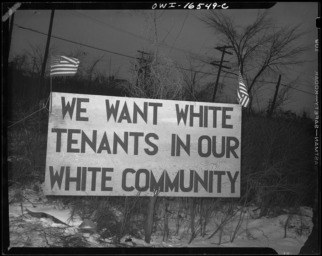
It is important to remember that, for reasons unrelated to the maps—but strongly related to racism—the great majority of urban Black families in the 1930s lived in neighborhoods that were often vibrant but had terrible housing conditions. The data, indeed, led one team of researchers who studied the HOLC maps in depth to conclude that “the assignment of a D rating […] to those neighborhoods where the share of Black families was higher would almost certainly have happened even if the HOLC decision makers had not known the race of the families in the neighborhood.” There were exceptions, but they were rare.
When and how did things change?
The HOLC maps were made in the 1930s during the Great Depression, before the Second Great Migration and before white flight. At that time, the population of cities like Cleveland and Detroit was less than 10 percent Black. The vast majority of Black families lived in areas to which they were confined by both legal barriers and informal pressures. While on average Black family incomes were lower than those of white families, these segregated Black neighborhoods included many working-class and middle-class families with solid incomes, and even some wealthy families, living side by side with low-income and poor families.
Between 1940 and 1980, the demographics of American cities changed dramatically. During those years, 5 million Black people fled Southern oppression and racial violence for Northern cities. During the same years, however, 15 million white people left America’s cities for the suburbs and the Sunbelt. This migration was overwhelmingly white, because racial discrimination by developers, private lenders, and the FHA kept all but a handful of Black families from moving to the new suburban housing being built outside the central cities.
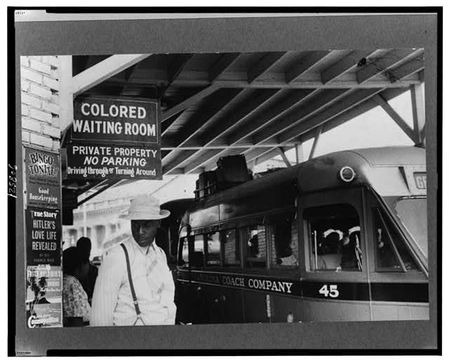
The FHA, which was created in 1934 to insure the mortgages that lenders made to new home buyers, was overtly racist. The FHA’s Underwriting Manual, the first version of which appeared in 1934, initially encouraged use of racial covenants. As late as 1960, Black families made up 6 percent of all American homeowners but held only 2.5 percent of outstanding FHA mortgages. The greatest impact of FHA discrimination, though, was to all but bar Black families from buying homes in the new suburban developments that proliferated in the late 1940s and 1950s.
One should not just blame the FHA. The FHA took its cues from the private lenders it worked with. Government action did not drive the actions of racist private lenders. If anything, it was the other way around.
Indeed, to believe that a typical white male lender or developer in the 1940s or 1950s (they were mostly male), unconstrained by either law or social norms, needed the sanction of a government map to discriminate against Black buyers stretches credulity beyond the breaking point.
While they were blocked from the suburbs, Black families found new housing opportunities in the formerly white working-class, middle-class, and upper-class neighborhoods of the cities as white residents left for the suburbs. Black families moved out of the ghettos, while new Black arrivals dispersed across the cities’ neighborhoods according to their economic means. From that point on, urban Black communities, which had previously been economically integrated, split along economic lines.
The most affluent Black families moved to urban areas that were classified A or B on the HOLC maps, often suburban in character although located inside central cities. Most of them became homeowners. These areas became the Black middle-class neighborhoods of subsequent decades. The next group moved to C areas, where about half of them became homeowners. Overall, Black homeownership in the seven cities studied increased dramatically, going from only 10 percent in 1940 to nearly 50 percent by 1980.
The poorest Black residents and new migrants from the South, though, either stayed where they were in the D areas or moved into other parts of the D areas, which were being rapidly vacated by the children of low-income white immigrants moving to the suburbs. Those areas were closest to where Black residents had been concentrated, and their rents were the lowest in the city. Most of those Black families became or remained renters. In 1980 in Baltimore, the median income of Black households in D areas (in 2023 dollars) was $26,000, while in C areas it was $45,000, and in A/B areas it was $67,000.
Along with reinforcing racial segregation while introducing more economic segregation, there was another result of all these migrations—disinvestment. Between 1940 and 1980, over 90 percent of all Black families moved into A, B, and C areas, which had better housing and offered far more opportunity for homeownership. The D areas, white or Black, which had been densely crowded neighborhoods in 1940, were depopulated. Between 1940 and 1980, nine white people left Detroit’s D areas for every one Black person who moved in. The population of Detroit’s D areas fell from 751,000 to 332,000, while the Black share of the population in those areas went from 19 percent to 56 percent. By that point, three out of four Black residents of Detroit lived outside the D areas.
To sum up, between 1940 and 1980:
- Large parts of formerly white D areas in the cities became predominately Black areas, creating new racially segregated areas.
- Those D areas were occupied by the lowest-income Black families, thus becoming areas of concentrated Black poverty.
- Far more white families left the D areas than Black families moved in, leading to a collapse of these areas’ housing markets and widespread housing abandonment that still affects these areas to this day.
It was this process, repeated in city after city, that turned the areas that had been classified D by the HOLC in the 1930s into the areas of concentrated Black poverty and abandoned housing that persist to this day. None of this was caused by the HOLC maps.
The only connection — and the reason that a statistical association exists between that and the HOLC maps — is that the D areas were the areas with the poorest quality and lowest cost housing to begin with. These were the areas the poorest Black families moved into after World War II as urban Black populations split along economic lines, and Black families who could afford more moved to the A, B, and C areas.
Since 1980, change has continued but more slowly. The population of the D areas is still shrinking, but now the families moving out are more likely to be Black than white. As suburban housing opportunities have opened up, the Black middle class has become suburbanized, and many Black middle-class neighborhoods in the central cities have lost ground. The difference between the economic level of Black residents of D and of C areas — so great in 1980 — has almost disappeared. Today, most poor Black households do not live in the D areas; less than a quarter of poor Black residents of Detroit or Baltimore now live in neighborhoods that were classified D in the 1930s.
Why does this matter?
This matters for a number of reasons.
First, it is important that we understand history correctly. In recent years, much effort has gone into rectifying the gaps in America’s racial history, bringing episodes and events to light that illuminate the workings of systemic racism in our country’s history. This is important work. But we should not replace old myths and misunderstandings with new ones.
The claim that the HOLC maps caused — in whole or in part — the distress and disadvantage in today’s low-income Black urban neighborhoods is a myth, not a reality. It needs to be put to rest.
Second, blaming the HOLC maps suggests that we’ve found the villain to blame for the many social, economic, physical, and environmental challenges facing low-income Black communities, and therefore can stop looking. When researchers from Columbia University write in a study of urban heat islands that “a consequence of [the maps] was the entrenched environmental repercussions, characterized by significant temperature and greenspace disparities that resonate to this day,” (emphasis added) they are not only misreading history but also failing to acknowledge the complex processes that actually led to today’s very real racial and spatial disparities. Those disparities are systemic, and among their roots and the manner in which they have been perpetuated are both overtly racist elements and other apparently race-neutral factors that may have no racial intent but that in context nonetheless have racial effects.
Moreover, suggesting that that reality has been predetermined (by the maps) denies people their most valuable attribute, their agency. The Black families who moved out of the areas to which they had been confined; who dealt with blockbusting, predatory contract sellers, and other challenges; who stabilized neighborhoods; and who became homeowners should be celebrated, as should those who worked to build community against daunting odds. Though they faced and continue to face the effects of past racist actions, we should not cast them as passive victims of decisions made decades earlier. That not only does them a disservice as individuals; it also works against coming up with effective solutions for the challenges they face.
Finally, bad history makes for bad policy. While many (but far from all) of the areas that were redlined on the maps remain areas of concentrated Black poverty today, they are no longer the areas where most poor Black people live or where the most urgent challenges necessarily exist. Policies or strategies that target areas because they fell into a particular category on some 1930s maps, as proposed by a number of candidates in the 2020 Democratic presidential primary, whether advocated as a means of redress or based on the mistaken belief that those areas are where most poor Black families live, is bad policy.
We should not allow our misreading of the past to distort our understanding of today’s realities and drive our policy choices today. Strategies that fail to take into account all the relevant factors, including the powerful effects of markets and economic disparities, are unlikely to bring any meaningful improvement to the lives of struggling low-income Black families.
Further reading
- Alan Mallach’s original manuscript submitted to and published with revisions as “Shifting the Redlining Paradigm: The Home Owners’ Loan Corporation Maps and the Construction of Urban Racial Inequality” by Taylor & Francis in Housing Policy Debate on March 11, 2024: https://shelterforce.org/wp-content/uploads/2024/08/HOLC-and-Redlining-paper_Mallach_author-submission.pdf
- Mallach, Alan. “Shifting the Redlining Paradigm: The Home Owners’ Loan Corporation Maps and the Construction of Urban Racial Inequality” by Taylor & Francis in Housing Policy Debate on March 11, 2024. The published version is available at https://www.tandfonline.com/doi/full/10.1080/10511482.2024.2321226 (paywall)
- Michney, Todd M., and LaDale Winling. "New perspectives on new deal housing policy: explicating and mapping HOLC loans to African Americans." Journal of Urban History 46.1 (2020): 150-180. https://journals.sagepub.com/doi/abs/10.1177/0096144218819429 (paywall)
- Michney, Todd M. "How the city survey’s redlining maps were made: a closer look at HOLC’s mortgagee rehabilitation division." Journal of Planning History 21.4 (2022): 316-344. https://journals.sagepub.com/doi/abs/10.1177/15385132211013361 (paywall)
- A short piece by Michney covering much of the material in the above paper (without paywall), entitled “How and Why the HOLC Made its Redlining Maps“ is available at https://dsl.richmond.edu/panorama/redlining/howandwhy
- Fishback, Price, et al. "New evidence on redlining by federal housing programs in the 1930s." Journal of Urban Economics (2022): 103462. https://www.nber.org/system/files/working_papers/w29244/w29244.pdf
- Fishback, Price V., et al. Race, risk, and the emergence of federal redlining. No. w28146. National Bureau of Economic Research, 2020. https://randallwalsh.com/wp-content/uploads/2020/12/Redlining.pdf
- Fishback, Price V., et al. "The HOLC maps: How race and poverty influenced real estate professionals’ evaluation of lending risk in the 1930s." The Journal of Economic History 83.4 (2023): 1019-1056. https://www.cambridge.org/core/services/aop-cambridge-core/content/view/A1BC46058B2EDCBD796977FF66B33FA3/S0022050723000475a.pdf/holc_maps_how_race_and_poverty_influenced_real_estate_professionals_evaluation_of_lending_risk_in_the_1930s.pdf
- Gioielli, Robert. The Tyranny of the Map: Rethinking Redlining. The Metropole, Nov. 2022 https://themetropole.blog/2022/11/03/the-tyranny-of-the-map-rethinking-redlining/
- A perspective from a respected urban historian Hillier, Amy E. "Redlining and the Home Owners' Loan Corporation." Journal of Urban History 29.4 (2003): 394-420. https://repository.upenn.edu/server/api/core/bitstreams/8c48fb68-5ccf-4e1e-aa6c-0c04ba18da4d/content
- Light, Jennifer S. "Nationality and neighborhood risk at the origins of FHA underwriting." Journal of Urban History 36, no. 5 (2010): 634-671. https://journals.sagepub.com/doi/abs/10.1177/0096144210365677 (paywall). While Light’s paper is about FHA underwriting rather than the HOLC maps, it offers valuable insight into 1930’s thinking about race, nationality and “neighborhood risk.”
Alan Mallach is a senior fellow with the Center for Community Progress, a Planetizen blogger, and author of The Divided City: Poverty and Prosperity in Urban America.

Segregated by Design

Measuring Neighborhood Segregation and Diversity

Planning for Racial Equity

Planetizen Federal Action Tracker
A weekly monitor of how Trump’s orders and actions are impacting planners and planning in America.

Chicago’s Ghost Rails
Just beneath the surface of the modern city lie the remnants of its expansive early 20th-century streetcar system.

Amtrak Cutting Jobs, Funding to High-Speed Rail
The agency plans to cut 10 percent of its workforce and has confirmed it will not fund new high-speed rail projects.

Ohio Forces Data Centers to Prepay for Power
Utilities are calling on states to hold data center operators responsible for new energy demands to prevent leaving consumers on the hook for their bills.

MARTA CEO Steps Down Amid Citizenship Concerns
MARTA’s board announced Thursday that its chief, who is from Canada, is resigning due to questions about his immigration status.

Silicon Valley ‘Bike Superhighway’ Awarded $14M State Grant
A Caltrans grant brings the 10-mile Central Bikeway project connecting Santa Clara and East San Jose closer to fruition.
Urban Design for Planners 1: Software Tools
This six-course series explores essential urban design concepts using open source software and equips planners with the tools they need to participate fully in the urban design process.
Planning for Universal Design
Learn the tools for implementing Universal Design in planning regulations.
Caltrans
City of Fort Worth
Mpact (founded as Rail~Volution)
City of Camden Redevelopment Agency
City of Astoria
City of Portland
City of Laramie


