infographics

Visualizing the Housing Stock of American Cities
A simple chart allows an easy comparison between the varieties of housing that comprise the housing stock of U.S. cities.

Comparing the World's Transit Systems
How does New York stack up compared to London, Tokyo, or even Moscow?

A Map of Worldwide Speed Limits
Do you have a need for speed? Or at least a need to know the speed limit anywhere in the world? Greater Greater Washington has just the map for you.
Friday Eye Candy: A Colorful Weather Visualization for Urban Weather
Part infographic and part diary, the weather radials project tracks the weather for every day in 2013.
A Closer Look at Detroit's Blighted Properties
The New York Times has produced a pair of visualization tools to present the findings of the recent report by Detroit's Blight Removal Task Force.

Where’s the Nearest Airport? New Diagram Shows—for Every Place on Earth
"Each region is closer to a particular airport than any other," explains the creator of what's called a spherical Voronoi diagram. The diagram illustrates just how far that airport is.
What Does Citi Bike Data Reveal About New York City?
A website called I Quant NY has produced a string of posts examining recent ridership data released by Citi Bike. The visualizations and maps produced by the site make a good case for the value of open data.

Watch the U.S. Population Grow Over Time
Movoto turned U.S. population density maps into an animated gif to show how the population has expanded over time.
Friday Eye Candy: 40 More Maps That Explain Everything
It's hard to keep up with the endless quest to present the world's knowledge in map form, but luckily we've got Max Fisher as a guide. He's collected 40 more fascinating maps that explain world history, present conditions and future scenarios.
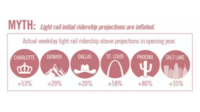
Infographics: The Truth About Transit
Since it has struggled with aggressive transit foes over half-cent sales taxes and light rail, Charlotte, North Carolina's transit system is launching a campaign to dispel myths about transit with crisp, clear infographics.
Fascinating Friday: 80 Maps That Explain Everything
The battle over who can present the most compelling infographical maps is apparently escalating. The good news, no matter the result, we all win. While these 80 maps may not explain everything, they sure do say a lot.

Mapping the United States of Parking
With arresting infographics, architect Seth Goodman aims to expose the absurd parking requirements that can be found in cities across America.
Stunning Videos Of Public Transit Patterns
Data visualizations show the daily ebb and flow of public transit traffic in world's major cities.
Infographic Evaluates the World's Greenest Cities
An informative, detailed, and attractive infographic from the vacation rental website HouseTrip compares the environmental credentials of London, New York, Vancouver, Copenhagen, Amsterdam, and Stockholm, across a range of categories.
The Benefits of Mass Transit, in one Incredible Infographic
Kaid Benfield directs our attention to "a terrific, poster-sized graphic highlighting the benefits of public transportation" that was created by an unlikely source - a credit card comparison website.
Friday Amusement: Transportation Infographics
Delicious offers an engaging collection of transportation-related infographics, from the history of transportation to why freeway traffic occurs.
Top 5 Urban Infographics
Yuri Artibise is an expert on infographics and has chosen his favorite ones on cities.
What's in a name? Google may have the answer
Google Labs has released another fascinating tool for researchers. Readers may already be familiar with Google Trends which can chart and reveal trends in search patterns for the last decade. The new tool allows similar analysis of Google's impressive library of digitized books spanning centuries.
Making Sense of Street Vendor Regulations
The Center for Urban Pedagogy wants to make city codes understandable to the people that are impacted. With that in mind, CUP tackled New York's regulations for street vendors.
Visualizing The World's Public Transit
This info-graphic from Good compares subways an rapid transit rail systems from around the world, by track miles and ridership.
Urban Design for Planners 1: Software Tools
This six-course series explores essential urban design concepts using open source software and equips planners with the tools they need to participate fully in the urban design process.
Planning for Universal Design
Learn the tools for implementing Universal Design in planning regulations.
Gallatin County Department of Planning & Community Development
Heyer Gruel & Associates PA
JM Goldson LLC
City of Camden Redevelopment Agency
City of Astoria
Transportation Research & Education Center (TREC) at Portland State University
Jefferson Parish Government
Camden Redevelopment Agency
City of Claremont