


Good news for the United States is found in a recent series of maps by NASA. Air pollution has significantly improved around the country.
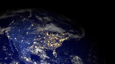
Rick Noack shares the news: "NASA scientists created a series of maps that show the "human fingerprint on global air quality." The images offer insights into air pollution in nearly 200 cities around the world, as well as in neighboring areas."
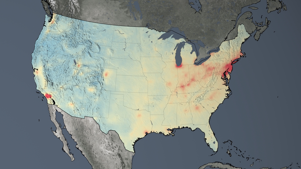
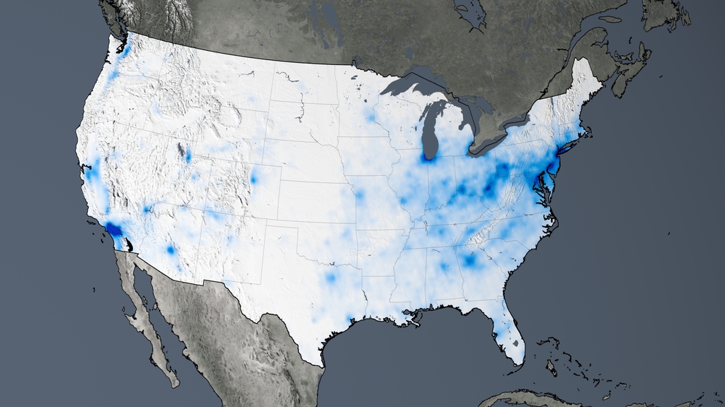
"To illustrate to what extent pollution has increased or decreased, the NASA researchers measured concentrations between 2005 and 2014. Blue areas indicate a decrease in pollution; orange indicates an increase," adds Noack.
Noack notes the good news: "the scientists concluded that the United States, Europe and Japan have greatly improved their air quality." The bad news, however: "pollution has worsened in parts of China, India and the Middle East."
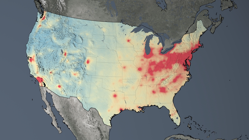
Average nitrogen dioxide concentrations across the United States in 2014. (Map created by NASA's Goddard Space Flight Center)
The trend map showing the decreases in nitrogen dioxide concentrations from 2005 to 2014. (Map created by NASA's Goddard Space Flight Center)
A detailed post on NASA also explains the study and the mapping exercise.
FULL STORY: This world map shows where pollution is getting worse. There’s good news for the U.S.


Wisconsin Republicans Block Congestion, Pollution Funds From Bike and Ped Projects
It was always a risk that states would use funding from the federal Infrastructure Investment and Jobs Act to double down on the transportation systems that create congestion and air pollution.

The Trump Administration's Environmental Policies Have Consequences for Black Lives
A Trump administration decision not to tighten Clean Air Act restrictions on soot pollution will have more consequences for Black Americans.

As Coronavirus Spreads, Air Pollution Plummets
More people are driving less and staying at home. The result is significant improvements in air quality in cities across the country.

Maui's Vacation Rental Debate Turns Ugly
Verbal attacks, misinformation campaigns and fistfights plague a high-stakes debate to convert thousands of vacation rentals into long-term housing.

Planetizen Federal Action Tracker
A weekly monitor of how Trump’s orders and actions are impacting planners and planning in America.
In Urban Planning, AI Prompting Could be the New Design Thinking
Creativity has long been key to great urban design. What if we see AI as our new creative partner?

King County Supportive Housing Program Offers Hope for Unhoused Residents
The county is taking a ‘Housing First’ approach that prioritizes getting people into housing, then offering wraparound supportive services.

Researchers Use AI to Get Clearer Picture of US Housing
Analysts are using artificial intelligence to supercharge their research by allowing them to comb through data faster. Though these AI tools can be error prone, they save time and housing researchers are optimistic about the future.

Making Shared Micromobility More Inclusive
Cities and shared mobility system operators can do more to include people with disabilities in planning and operations, per a new report.
Urban Design for Planners 1: Software Tools
This six-course series explores essential urban design concepts using open source software and equips planners with the tools they need to participate fully in the urban design process.
Planning for Universal Design
Learn the tools for implementing Universal Design in planning regulations.
planning NEXT
Appalachian Highlands Housing Partners
Mpact (founded as Rail~Volution)
City of Camden Redevelopment Agency
City of Astoria
City of Portland
City of Laramie