


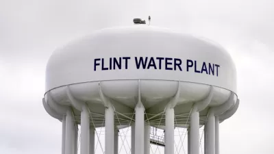
The Washington Post shows why the Flint water crisis is so concerning for the health of the residents affected.
Christopher Ingraham presents visual evidence of the Flint water crisis in the form of a series of infographics. The infographics use data gathered by "[a] group of Virginia Tech researchers who sampled the water in 271 Flint homes last summer found some contained lead levels high enough to meet the EPA's definition of 'toxic waste.'"
The infrographics show what the lead exposure in the drinking water supply of nearby cities like Detroit (2.3 parts per billion) and Troy (1.1 parts per billion) looks like, followed by the 90th percentile of the Flint homes (27 parts per billion) and the highest level found in the sample (158 parts per billion). That last sample was found at a home in the city's 8th Ward, which was using water at "more than 10 times the EPA limit" and "30 times higher than the 5 ppb reading that can indicate unsafe lead amounts."
FULL STORY: This is how toxic Flint’s water really is

1,700 Flint Residents Sue U.S. EPA for $722 Million in Damages
Flint residents are suing the U.S. Environmental Protection Agency for damages caused by exposure to lead in the city's drinking supply.
How the U.S. Environmental Protection Agency Failed the People of Flint
While blame squarely lays with Michigan state officials, agencies, and possibly Gov. Rick Snyder himself, the EPA also played a role by both detecting the cause of the problem but not acting on the reports of improper treatment of river water.
First Step to Restoring Drinking Water for Flint—Coat the Existing Pipes
Gov. Rick Snyder (R-Mich.) announced on Wednesday that the state is working to ensuring safe tap water for Flint residents. While there is no schedule to replace the corroded lead pipes, they are being treated to prevent further lead leaching.

Planetizen Federal Action Tracker
A weekly monitor of how Trump’s orders and actions are impacting planners and planning in America.

Chicago’s Ghost Rails
Just beneath the surface of the modern city lie the remnants of its expansive early 20th-century streetcar system.
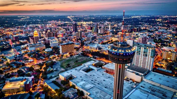
San Antonio and Austin are Fusing Into one Massive Megaregion
The region spanning the two central Texas cities is growing fast, posing challenges for local infrastructure and water supplies.

Since Zion's Shuttles Went Electric “The Smog is Gone”
Visitors to Zion National Park can enjoy the canyon via the nation’s first fully electric park shuttle system.

Trump Distributing DOT Safety Funds at 1/10 Rate of Biden
Funds for Safe Streets and other transportation safety and equity programs are being held up by administrative reviews and conflicts with the Trump administration’s priorities.

German Cities Subsidize Taxis for Women Amid Wave of Violence
Free or low-cost taxi rides can help women navigate cities more safely, but critics say the programs don't address the root causes of violence against women.
Urban Design for Planners 1: Software Tools
This six-course series explores essential urban design concepts using open source software and equips planners with the tools they need to participate fully in the urban design process.
Planning for Universal Design
Learn the tools for implementing Universal Design in planning regulations.
planning NEXT
Appalachian Highlands Housing Partners
Mpact (founded as Rail~Volution)
City of Camden Redevelopment Agency
City of Astoria
City of Portland
City of Laramie