


A new layer showing the seven-day average of confirmed COVID-19 cases started rolling out to Android and iPhones last week.

Nicole Wetsman reports on a new layer coming to Google Maps that will allow people to keep track COVID-19 infections while navigating the locations of their lives:
Google Maps will soon include information on COVID-19 spread in states, counties, and some cities. Toggling on the “COVID” layer in the app will show the seven-day average number of confirmed cases in each area per 100,000 people. Areas of the map will be color-coded based on case rate, and a label shows if cases are going up or down. The feature will roll out on Android and iOS this week.
According to a blog post written by Sujoy Banerjee, a Google Maps project manager, the new layer will help people to "make more informed decisions about where to go and what to do."
The new COVID-19 map layer pulls data from Johns Hopkins’ COVID-19 dashboard, The New York Times, and Wikipedia, according to Wetsman.
"This is one of many pandemic-related features introduced in Google Maps over the past few months — the app also includes alerts about face-covering mandates on public transportation, information about takeout options at restaurants, and warnings to call ahead to a doctor’s office if you think you have COVID-19," adds Wetsman.
FULL STORY: Google Maps adds an overlay of COVID-19 case trends


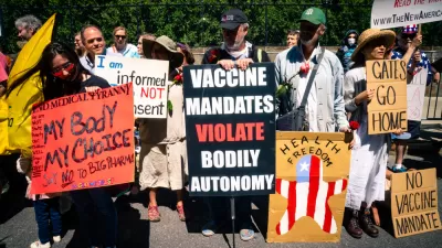
Friday Eye Candy: Covid-19, Then and Now
The New York Times compared images from readers portraying similar scenes in 2020 and 2022.
The Shifting Demographics of Covid-19
For most of the Covid-19 pandemic, Black Americans died at much higher rates than White Americans. That trend has reversed at times during the past year.

Acceptable Deaths
What can we learn from our Covid response?

Maui's Vacation Rental Debate Turns Ugly
Verbal attacks, misinformation campaigns and fistfights plague a high-stakes debate to convert thousands of vacation rentals into long-term housing.

Planetizen Federal Action Tracker
A weekly monitor of how Trump’s orders and actions are impacting planners and planning in America.

In Urban Planning, AI Prompting Could be the New Design Thinking
Creativity has long been key to great urban design. What if we see AI as our new creative partner?

King County Supportive Housing Program Offers Hope for Unhoused Residents
The county is taking a ‘Housing First’ approach that prioritizes getting people into housing, then offering wraparound supportive services.

Researchers Use AI to Get Clearer Picture of US Housing
Analysts are using artificial intelligence to supercharge their research by allowing them to comb through data faster. Though these AI tools can be error prone, they save time and housing researchers are optimistic about the future.

Making Shared Micromobility More Inclusive
Cities and shared mobility system operators can do more to include people with disabilities in planning and operations, per a new report.
Urban Design for Planners 1: Software Tools
This six-course series explores essential urban design concepts using open source software and equips planners with the tools they need to participate fully in the urban design process.
Planning for Universal Design
Learn the tools for implementing Universal Design in planning regulations.
planning NEXT
Appalachian Highlands Housing Partners
Mpact (founded as Rail~Volution)
City of Camden Redevelopment Agency
City of Astoria
City of Portland
City of Laramie