


Planners are increasingly using social media for public engagement. How can you analyze what people are saying? NodeXL is an easy to use free tool for scraping and analyzing social media. I use this tool to report from the APA National Conference.


Every year I report on Twitter activity at the American Planning Association National Conference. With thousands of planners descending on Phoenix, Arizona this weekend, the #APA16 hashtag is already starting to heat up. Throughout the conference myself, @EvansCowley, and @p18holland will be scraping everything that participants tweet about from the conference. In this blog, Patrick Holland and I share how easy it is to scrape and analyze social media.
What is scraping? Scraping is a technique for extracting information from websites. In this case, I am scraping information from Twitter, looking specifically for anyone using the #APA16 hashtag.
How can I scrape? I use an Excel plugin called NodeXL. NodeXL has a free and a paid version. Included here is part of the free version. NodeXL allows you to scrape social media and also allows for visualization of the data.
After you have downloaded NodeXL, you can get started.
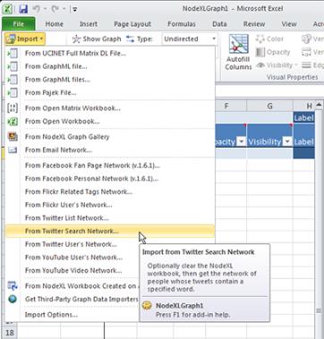 Select the NodeXL tab in the excel spreadsheet. Choose import—then the social media network you would like to analyze. We are using Twitter for this conference, but options for Facebook, YouTube, and Flicker are also available. Once "From Twitter Search Network" has been selected you have the option to "Search for tweets that match this query." Attendees at this conference will be tweeting using the hashtag #APA16 so this is the query we want to match. You can also search for tweets associated with a particular user or keywords. The free version will limit you to 2,000 tweets at a time. In our case, we are scraping using NodeXL each day to ensure we don’t miss any tweets.
 NodeXL imports the social media data onto five separate sheets in Excel. One feature I will highlight is if you select an individual tweet (known as a vertex) on the graph, you can see the interactions people had with that tweet. Pre-conference, people showed particular interest in retweeting and favoriting tweets about technology. The most popular tweet as of April 1st was "@medialabOn 4/3, @MITCities presents its CityScope urban planning/simulation tools at #apa16 http://mitsha.re/ZTl6H".
Once you have imported your scraped data you will find that NodeXL is quite similar to using your regular Excel spreadsheets. Using NodeXL, you will see who sent each tweet, the time of the tweet, whether the tweet was mentioned by other people, any links included in the tweets, and how connected users are to each other. You will be able to create graphs, filter data, and analyze to your hearts content. For example, in the case of @medialab's tweet on simulation tools was retweeted 31 times and favorited 59 times. We can see this was retweeted by @MeagBooth and favorited by @mysidewalkHQ.
Tutorials on YouTube help anyone who would like to learn how to use the program.
Those at the conference: be sure to use the #APA16 hashtag, and stay tuned for the results of this analysis at the end of the conference.


Trends from the APA 2015 Conference
Every year we analyze all of the tweets from the APA Conference and tell you about the trends in planning. With 2,884 people tweeting from the APA Conference, there is a lot of great ideas, links, and pictures that we can all learn from.

Phoenix Seeks to Adopt AI for City and Regional Planning
An extension of the Phoenix metro region’s half-cent transportation sales tax by voters this November would give the city a green flag, and funding, to expand its use of AI as a planning tool.

Building Bridges to the Future: Preparing the Next Generation of Planners
Discover the importance of preparing the next generation of urban planners to build a sustainable and thriving future.

Planetizen Federal Action Tracker
A weekly monitor of how Trump’s orders and actions are impacting planners and planning in America.

Chicago’s Ghost Rails
Just beneath the surface of the modern city lie the remnants of its expansive early 20th-century streetcar system.

San Antonio and Austin are Fusing Into one Massive Megaregion
The region spanning the two central Texas cities is growing fast, posing challenges for local infrastructure and water supplies.

Since Zion's Shuttles Went Electric “The Smog is Gone”
Visitors to Zion National Park can enjoy the canyon via the nation’s first fully electric park shuttle system.

Trump Distributing DOT Safety Funds at 1/10 Rate of Biden
Funds for Safe Streets and other transportation safety and equity programs are being held up by administrative reviews and conflicts with the Trump administration’s priorities.

German Cities Subsidize Taxis for Women Amid Wave of Violence
Free or low-cost taxi rides can help women navigate cities more safely, but critics say the programs don't address the root causes of violence against women.
Urban Design for Planners 1: Software Tools
This six-course series explores essential urban design concepts using open source software and equips planners with the tools they need to participate fully in the urban design process.
Planning for Universal Design
Learn the tools for implementing Universal Design in planning regulations.
planning NEXT
Appalachian Highlands Housing Partners
Mpact (founded as Rail~Volution)
City of Camden Redevelopment Agency
City of Astoria
City of Portland
City of Laramie