


Aside from inspiring a classy wardrobe, what can urban planners learn from characters like Don Draper and Peggy Olson? What cues should urban planners and policy makers take from the field of advertising to help pitch planning ideas?

Urban planners are problem solvers, proposing changes to the status quo. Lasting change requires buy-in from the community, but getting buy-in for complicated policies or controversial plans is not always easy. In a quest to satisfy legal requirements, planners often focus on presenting codes, statutes, and statistics. When more time and resources go toward framing the legal argument, less time is spent crafting and managing the “big picture.” Presentations and reports rely on safe buzz words and generic phrases like “sustainable growth” or “walkable urbanism.” These canned phrases blur, rather than articulate, our planning ideas and do little to inform or engage the public. If there is one thing to learn from Don Draper, it is the power of painting a vivid picture that is part of a larger story.
As planners, our ideas are our currency. But to have value, we must learn how to sell our ideas. Who better to teach us than the masters of the pitch? As the final season of Mad Men approaches, let’s take a closer look at how the real ad men and women create powerful campaigns and memorable messages. Here are seven lessons to help Don Draperize your next presentation.
1. Make it Personal; Be Relatable
“You are the product. You feeling something. That’s what sells.” – Don Draper, Mad Men
Planning is about people. How we live, where we live, the way we aspire to live—these are simple but fundamental questions for planners to take into consideration. Talk about yourself, your life, and the choices you face. Housing affordability, traffic congestion, gentrifying neighborhoods—these are issues that affect us too—not just the public. Find ways to relate your planning projects to your own life.
This past spring, Dove made headlines with a thought-provoking documentary, titled “Dove Real Beauty Sketches,” revealing women’s perceptions of their beauty and related insecurities through personal interviews and a clever drawing exercise. The video builds a relationship between women, the consumers, and Dove, the company. If Dove understands what it feels like to be a woman, then perhaps women will trust Dove with their skin. The power of the story comes from the women’s honesty and vulnerability—they are raw, real, and relatable.
2. Tell a Story
“Being noticed isn’t enough anymore. You also have to reach hearts and minds.” – Ogilvy Washington, Creative Studio [1]
Stories are the natural way people process information. Who are the characters? What makes them tick? What challenges do they face? How do they resolve their conflicts? When preparing a presentation for your plans, consider the stakes. What does your audience stand to gain or lose? Who are the key players and how do they relate to each other? Humanize your proposal by tapping into emotions. Incorporate anecdotes, humor, and suspense to grab the audience’s attention.
To market the web browser Chrome, Google launched a series of short videos that tell simple stories—from the relationship between a father and daughter (“Dear Sophie”) to the virtual ties between a megastar (Lady Gaga) and her fans (“The Edge of Glory”). The videos pull at our heartstrings, cleverly weaving Google products into stories of how everyday people keep in touch. The stories show the value of the products, rather than telling us why to use them. The Chrome video campaign breaks downs the walls of a giant corporation by inviting viewers to share intimate moments with the characters, as if they were a family member or close friend.
The business magazine Forbes has taken notice of storytelling as a key skillset and recently published Not Just for Bedtime, Marketers Corner the Market on Storytelling. While a planner is not typically trained as a storyteller, there is no reason she or he cannot become one with training and practice. Master storyteller Ira Glass, from the award-winning podcast, “This American Life”, shares his thoughts on the four components for good storytelling (here).
3. Brand It
“Their value builds for years, and over time, a good tagline can be your best and least expensive form of advertising.” – Wild East Group, Brand Management and Business Development Agency. [2]
Give your project a brand, tagline, and graphic “look” that are simple, memorable, and tied to the core value of your message. When Nike launched the “Just Do It” campaign, their market share rose from 18 percent to 43 percent; annual sales skyrocketed from $800 million in 1988 to over $9.2 billion a decade later.[3] The “Just Do It” tagline is about more than sportswear; it is a mindset, and a compelling one. Synonymous with Nike’s tagline is the simple “swoosh” symbol that has global recognition. Do not underestimate the power of a persuasive tagline and logo to propel your planning project forward.

An example from the planning world: when the city of Los Angeles was looking to transform a major corridor in Downtown Los Angeles, the project team made a concerted effort to shorten the uninspiring and wordy project name “Figueroa Boulevard Corridor Streetscape Plan” to “MyFig.” The catchy tag line cleverly transfers ownership of the street to the people. The project materials make it clear that each person has a relationship with MyFig. The project website engages and informs visitors. “What’s Your Fig?” asks the public for suggestions to improve their corridor, while “GoFig” provides information on transportation services. The consistent look and branding has helped raise awareness, attract media attention, and encourage more people to participate in the planning process.
4. Simplify
“Most campaigns are too complicated. They reflect a long list of objectives, and try to reconcile the divergent view of too many executives. By attempting to cover too many things, they achieve nothing.” – David Ogilvy, Ogilvy on Advertising. [4]
Boil your message down to three or four key points. A laundry list of project goals will dilute your message. Take time to establish a hierarchy in the information you want to present. Then get to the point fast and do not waste words. The human mind is hard-wired to remember information in groups of four or less. “The more people are asked to recall, the less accurate their recollection is.”[5]
Help your reader follow the flow of information with headers and other visual cues to strengthen the hierarchy. Use lists and bullets, rather than sentences, where possible. Be precise and avoid jargon, acronyms, and repetitive adjectives. “Reliance on long words, which are often more abstract than common short ones, can be a sign that you have not worked out exactly what you want to say.”[6] Do the Twitter test and ask yourself—can I make my point in 140 characters?

The advertising industry would never dream of leaving the consumer to guess the main point of their message, and neither should planners. In 2009, the Los Angeles County Metropolitan Transportation Authority (Metro) rebranded the look of their marketing materials, developing simple, humorous print ads to help increase ridership. Their “opposites” campaign paired opposing words to market Metro (e.g. naughty vs. nice and problem vs. solution). The simplicity of the campaign was captivating. By trimming content, they arrived at the essence of their argument. The rebranding effort captured the attention of AIGA, the professional association of design (see a slideshow here). When crafting plans and policies, make sure you make a strong, cogent argument that can be communicated swiftly and simply.
5. Confront the Controversy
“Truth is the key to great marketing. In this day and age, with social media and gotcha journalism and Wikileaks, there is absolutely nowhere to hide. We believe in telling the truth to each other and we believe in telling the truth to the people we are trying to sell things to. Now, our job is to make it a beautiful truth, and to shine a great light on things that are true… we are great at telling stories that are truthful, and that’s why they resonate with people.” – Matt Jarvis, Chief Strategy Officer, 72andSunny. [7]
Don’t dance around the issues. When the advertising agency 72andSunny took on Samsung as their client in 2011, they did not develop ads that showcased the new features or look of Samsung’s phone. Instead, they tackled the real issue: their competitor, Apple. With “The Next Big Thing Is Already Here” campaign, Samsung played on the cultism of Apple’s customers, while at the same time making them appear as if they got the short end of the stick. Far from fanatics, Samsung’s customers looked humble and happy with their new phones, nonchalantly showing off the Samsung GS3 to a group of wide-eyed Apple braggarts.
Samsung’s bold decision to address the elephant in the room paid off. Over the course of the Next Big Thing campaign, Samsung surpassed Apple in global smartphone sales. This lesson applies to planners as well. When faced with tough urban issues like removing travel lanes for dedicated bus lanes or increasing parking fees to encourage more efficient land uses, confront the controversy at the outset. Be transparent; outline the pros and cons. Do not avoid the discussion or gloss over the controversy. This is the fastest way to create public distrust and lose your audience.
6. Tailor Your Message
“Don’t tell me how good you make it; tell me how good it makes me when I use it.” – Leo Burnett, creative communication company [8]
Advertisers are keenly aware that people are different, and as such, they must tailor their message to each demographic group. Products are advertised at different times and places and in different mediums to respond to the daily habits of consumer groups. With limited budgets and constrained timeframes, planners often fall victim to a one-size-fits-all campaign. This may work for some planning projects, but not all. Matching the message and the medium in which it is delivered to the target group is critical to getting planning ideas into the public realm.
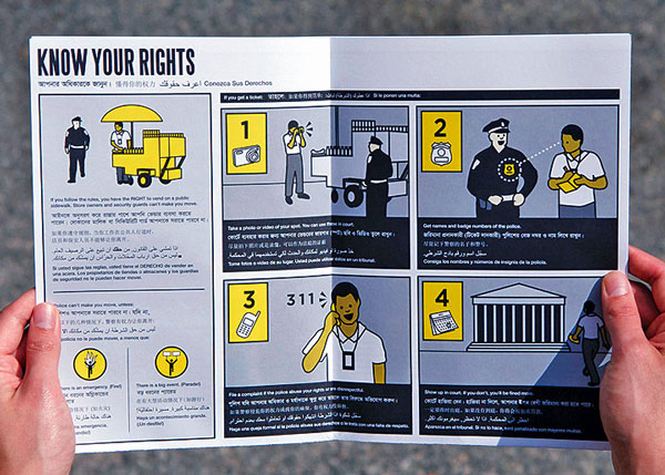
A great example of this technique is public artist, Candy Chang. With support from non-profit, Tenants & Neighbors, she redesigned the New York State’s official Tenants’ Rights Guide into a pack of simple, easy-to-read “flashcards” for renters. The cards cover everything from pets and paint to privacy and security deposits. While working with the Street Vendor Project, Ms. Chang took a similar approach and condensed New York City’s street vendor codes and regulations into a cartoon pamphlet with limited text that is translated into multiple languages. The design of the flashcards and pamphlet are intuitive and engaging; care was taken to tailor the message to the appropriate audience.
7. Make It Visual
We remember 10% of what we hear, 20% of what we read, and 80% of what we see and do. – Syntactic Theory on Visual Communication [9]
Studies indicate that the human memory is best suited to visual information. Presenters who use visual aids were shown to be 43 percent more effective in persuading audience members to take a desired course of action than presenters who do not use visuals.[10]
Use graphics, maps, charts, and photos to strengthen your message. A picture is worth a thousand words, but only if it is the right picture. Good visuals can illuminate data, articulate points, and guide the viewer through your thought process. Bad visuals can jumble your message, bore the audience, and misdirect attention. Make sure that your graphics are legible at the scale you plan to present and pass the ten-second rule (i.e. do you get the point within ten seconds). Are the images recognizable or pixelated? Are you charts clear? Are the labels and annotations necessary? Simplify graphics to eliminate superfluous information. Study your font size. Can it be read without squinting? Do the colors highlight the most important parts of your message?
Avoid what Edward Tufte calls “chart junk” (e.g. add-ons in Powerpoint like animations, 3D lettering, and drop shadow), which can clutter and distract the viewer from the data. Infographics are on the rise, but not all infographics are created equal. Spend time to evaluate your graphics and assure that they are helping, not hurting, your message. To look at some quality infographic campaigns, see Column Five Media’s work.
----
“As the world moves faster each day, it is necessary to communicate your message in a quick, clear, and engaging way that sets it apart from the noise.” – Column Five Media
With more data and information available to the public than ever before, and new mediums with which to share it, grabbing the attention of the public is not easy. Let us make sure that when we do have our audience’s attention, we are ready to make the most of it—with thoughtful, clear, and compelling messages.
Georgia Sheridan, AICP is a planner working in the Long Range and Mobility Planning Division at the City of West Hollywood. She co-teaches Visual Communication in the graduate program at the UCLA Luskin School of Public Affairs and the UC Davis Extension.
Amber Hawkes, AICP is an urban designer at Melendrez, an award-winning urban design, planning, and landscaping architecture firm in Downtown Los Angeles. She co-teaches Visual Communication in the graduate program at the UCLA Luskin School of Public Affairs and the UC Davis Extension.
[3] http://www.business2community.com/branding/just-turns-25-nike-profitable-tagline-time-0607709#!oYM8H
[4] Confessions of an Advertising Man, David Ogilvy
[5] 100 Things Every Designer Needs to Know About People, Susan Weinschenk
[6] Writing that Works, Kenneth Roman and Joel Raphaelson
[9] http://www.hp.com/large/ipg/assets/bus-solutions/power-of-visual-communication.pdf, Martin Paul Lestor, “Syntactic Theory on Visual Communication,” California State University of Fullerton, 1994-1996
[10] Persuasion and the Role of Visual Presentation Support, 3M and University of Minnesota School of Management, D. R. Vogel, 0. W. Dickson, and J. A. Lehman, 1986


Can We Please Give Communities the Design They Deserve?
Often an afterthought, graphic design impacts everything from how we navigate a city to how we feel about it. One designer argues: the people deserve better.

Elevating Environmental Journalism: A Masterclass in Climate Storytelling
Pulitzer Prize finalist Rosanna Xia visited the University of Hawai'i at Manoa, sharing her climate reporting expertise through sea level rise field tours, engaging storytelling workshops, and an inspiring public lecture.

Denver-Inspired Chatbot Serves as Prototype for AI in City Planning and Zoning
A prototype City Planning Chatbot uses AI to answer public questions on zoning and city planning in Denver. Although not endorsed by the City, the experiment demonstrates the potential power of AI to provide accurate planning and zoning answers.

Planetizen Federal Action Tracker
A weekly monitor of how Trump’s orders and actions are impacting planners and planning in America.

Maui's Vacation Rental Debate Turns Ugly
Verbal attacks, misinformation campaigns and fistfights plague a high-stakes debate to convert thousands of vacation rentals into long-term housing.
San Francisco Suspends Traffic Calming Amidst Record Deaths
Citing “a challenging fiscal landscape,” the city will cease the program on the heels of 42 traffic deaths, including 24 pedestrians.

Defunct Pittsburgh Power Plant to Become Residential Tower
A decommissioned steam heat plant will be redeveloped into almost 100 affordable housing units.

Trump Prompts Restructuring of Transportation Research Board in “Unprecedented Overreach”
The TRB has eliminated more than half of its committees including those focused on climate, equity, and cities.

Amtrak Rolls Out New Orleans to Alabama “Mardi Gras” Train
The new service will operate morning and evening departures between Mobile and New Orleans.
Urban Design for Planners 1: Software Tools
This six-course series explores essential urban design concepts using open source software and equips planners with the tools they need to participate fully in the urban design process.
Planning for Universal Design
Learn the tools for implementing Universal Design in planning regulations.
Heyer Gruel & Associates PA
JM Goldson LLC
Custer County Colorado
City of Camden Redevelopment Agency
City of Astoria
Transportation Research & Education Center (TREC) at Portland State University
Jefferson Parish Government
Camden Redevelopment Agency
City of Claremont