


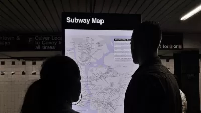
At a recent talk at the New York City Transit Museum, Massimo Vignelli, designer of the iconic 1972 NYC subway map, discussed his opinions of the subway maps that preceded and followed his groundbreaking design.
If your best known creation was hanging in the Museum of Modern Art, you might have reason to look askance at the designs that preceded and followed it. And when designer Massimo Vignelli recently offered his impressions of some of the other New York City subway maps that have appeared over the last century, he didn't disappoint.
For a little background: "When the NY MTA hired Vignelli to develop a new plan for subterranean navigation, he was tasked with streamlining the wayfinding process for riders and bringing New York into the future," says Tom Lisi. "Train routes were straightened into neat angles to make a tidy diagram out of the actual snarl of criss-crossing tunnels. Forty years later, graphic designers still laud Vignelli’s map as a triumph."
Here's Vignelli on the map that replaced his in 1979, after "confused passengers convinced the MTA to replace it":
"This is the map that came after our map. If you have to have abstract geography, why do you have it in any case? Why [sic] have it at all?
“And look at here [pointing to curved path of train line at lower Manhattan]. Who cares if the subway has to make a [turn] like that? I’m going, we’re all going, from Point A to Point B. How we get there is the conductor’s problem, not mine.”
And on the 2008 map:
“We belong to a culture of balloons. [The designers] grow up with comic books, and this is what happens. There’s balloons all over the place. It’s ridiculous.”
FULL STORY: Vignelli, Designer of Famous Subway Map, Defends His Version Over These Others (IMAGES)

Friday Eye Candy: Seven Maps of the NYC Subway
The modernist designer Massimo Vignelli, who created the 1972 version of the New York City Subway map, passed away this week at 83.

Can We Please Give Communities the Design They Deserve?
Often an afterthought, graphic design impacts everything from how we navigate a city to how we feel about it. One designer argues: the people deserve better.
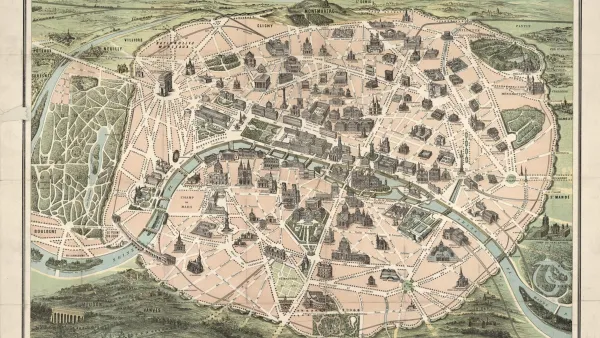
The New York Subway Map, Explained
An interactive feature reveals the origins and design choices of the New York Subway map.
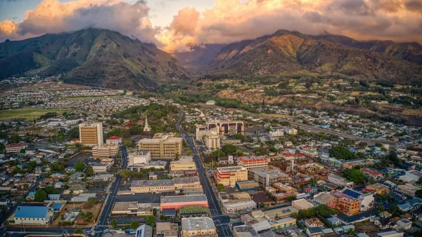
Maui's Vacation Rental Debate Turns Ugly
Verbal attacks, misinformation campaigns and fistfights plague a high-stakes debate to convert thousands of vacation rentals into long-term housing.

Planetizen Federal Action Tracker
A weekly monitor of how Trump’s orders and actions are impacting planners and planning in America.
In Urban Planning, AI Prompting Could be the New Design Thinking
Creativity has long been key to great urban design. What if we see AI as our new creative partner?

King County Supportive Housing Program Offers Hope for Unhoused Residents
The county is taking a ‘Housing First’ approach that prioritizes getting people into housing, then offering wraparound supportive services.

Researchers Use AI to Get Clearer Picture of US Housing
Analysts are using artificial intelligence to supercharge their research by allowing them to comb through data faster. Though these AI tools can be error prone, they save time and housing researchers are optimistic about the future.

Making Shared Micromobility More Inclusive
Cities and shared mobility system operators can do more to include people with disabilities in planning and operations, per a new report.
Urban Design for Planners 1: Software Tools
This six-course series explores essential urban design concepts using open source software and equips planners with the tools they need to participate fully in the urban design process.
Planning for Universal Design
Learn the tools for implementing Universal Design in planning regulations.
planning NEXT
Appalachian Highlands Housing Partners
Mpact (founded as Rail~Volution)
City of Camden Redevelopment Agency
City of Astoria
City of Portland
City of Laramie