


The Robert Wood Johnson Foundation, in partnership with the University of Wisconsin Population Health Institute, this week released the annual County Health Rankings. The rankings aim to inspire healthy community action.
An article on the Washington Post by Reid Wilson and Christopher Ingraham shares the data visualizations behind the Robert Wood Johnson Foundation’s annual County Health Rankings. The rankings use nearly three-dozen indicators to measure health outcomes across the country. Just as with last year’s rankings, the report makes the point that measures like high poverty, bad air and high obesity rates produce higher rates of premature deaths.
According to Wilson and Ingraham’s analysis of the rankings, “Southern states are more likely to have higher YPLL numbers. But the most extreme outliers are all in rural counties in North and South Dakota.”
The Washington Post coverage of the ranking includes ten maps “that best illustrate where Americans are healthiest, and why…” The maps include metrics like air pollution (fine particles per cubic meter); percent of adults that a report a Body Mass Index higher than 30; long commutes (percentage driving more than 30 minutes each way); and percent of children under age 18 in poverty.
FULL STORY: The 10 maps that illustrate the healthiest counties in America

Better Urban Planning for Better Public Health (In the Real World)
A researcher at the University of Sydney in Australia offers three recommendations for planners to better negotiate the real world of politics and governance to help create healthier communities.

Empowering Doctors to Help Solve Housing Challenges
A survey of the programs taking a proactive approach to the role of housing in health outcomes, and a call for more collaboration between the housing and healthcare industries

Denver Tackling its Troubling Public Health Disparities
A distance of two miles can mean the difference of living more than ten years longer in the city of Denver. The city and its residents are gathering resources to improve public health outcomes in all the city's neighborhoods.

Planetizen Federal Action Tracker
A weekly monitor of how Trump’s orders and actions are impacting planners and planning in America.

Maui's Vacation Rental Debate Turns Ugly
Verbal attacks, misinformation campaigns and fistfights plague a high-stakes debate to convert thousands of vacation rentals into long-term housing.
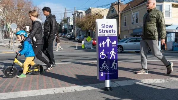
San Francisco Suspends Traffic Calming Amidst Record Deaths
Citing “a challenging fiscal landscape,” the city will cease the program on the heels of 42 traffic deaths, including 24 pedestrians.

Defunct Pittsburgh Power Plant to Become Residential Tower
A decommissioned steam heat plant will be redeveloped into almost 100 affordable housing units.

Trump Prompts Restructuring of Transportation Research Board in “Unprecedented Overreach”
The TRB has eliminated more than half of its committees including those focused on climate, equity, and cities.

Amtrak Rolls Out New Orleans to Alabama “Mardi Gras” Train
The new service will operate morning and evening departures between Mobile and New Orleans.
Urban Design for Planners 1: Software Tools
This six-course series explores essential urban design concepts using open source software and equips planners with the tools they need to participate fully in the urban design process.
Planning for Universal Design
Learn the tools for implementing Universal Design in planning regulations.
Heyer Gruel & Associates PA
JM Goldson LLC
Custer County Colorado
City of Camden Redevelopment Agency
City of Astoria
Transportation Research & Education Center (TREC) at Portland State University
Jefferson Parish Government
Camden Redevelopment Agency
City of Claremont