


The New York Times created a visualization of air pollution that allows comparisons between local conditions and the worst air pollution in the world.

Nadja Popovich, Blacki Migliozzi, Karthik Patanjali, Anjali Singhvi, and Jon Huang are credited on this one-of-a-kind data visualization, which brings home the reality of air pollution.
Scroll through the article as floating particles make the point about air quality in cities around the world, and the air quality during events occurring with more frequency, like the Camp Fire in Paradise in 2018.
But even the Camp Fire can't compare to the reality in New Delhi, where air pollution reached "apocalyptic highs" last month. The causes and effects of air pollution are summarized thusly:
This fine pollution mainly comes from burning things: Coal in power plants, gasoline in cars, chemicals in industrial processes, or woody materials and whatever else ignites during wildfires. The particles are too small for the eye to see — each about 35 times smaller than a grain of fine beach sand — but in high concentrations they cast a haze in the sky. And, when breathed in, they wreak havoc on human health.
FULL STORY: See How the World’s Most Polluted Air Compares With Your City’s

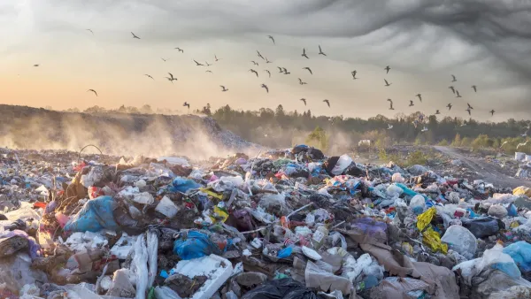
Colorado Landfills Emit as Much Pollution as 1M Cars
Landfills are the third-largest source of methane pollution in Colorado, after agriculture and fossil fuel extraction.

Driving Equity and Clean Air: California Invests in Greener School Transportation
California has awarded $500 million to fund 1,000 zero-emission school buses and chargers for educational agencies as part of its effort to reduce pollution, improve student health, and accelerate the transition to clean transportation.
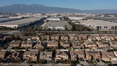
New California Law Regulates Warehouse Pollution
A new law tightens building and emissions regulations for large distribution warehouses to mitigate air pollution and traffic in surrounding communities.

Montreal Mall to Become 6,000 Housing Units
Place Versailles will be transformed into a mixed-use complex over the next 25 years.

Planetizen Federal Action Tracker
A weekly monitor of how Trump’s orders and actions are impacting planners and planning in America.

DARTSpace Platform Streamlines Dallas TOD Application Process
The Dallas transit agency hopes a shorter permitting timeline will boost transit-oriented development around rail stations.

Study: 4% of Truckers Lack a Valid Commercial License
Over 56% of inspected trucks had other violations.

Chicago Judge Orders Thousands of Accessible Ped Signals
Only 3% of the city's crossing signals are currently accessible to blind pedestrians.

Philadelphia Swaps Car Lanes for Bikeways in Unanimous Vote
The project will transform one of the handful of streets responsible for 80% of the city’s major crashes.
Urban Design for Planners 1: Software Tools
This six-course series explores essential urban design concepts using open source software and equips planners with the tools they need to participate fully in the urban design process.
Planning for Universal Design
Learn the tools for implementing Universal Design in planning regulations.
City of Mt Shasta
City of Camden Redevelopment Agency
City of Astoria
Transportation Research & Education Center (TREC) at Portland State University
US High Speed Rail Association
City of Camden Redevelopment Agency
Municipality of Princeton (NJ)