


Tim De Chant compares satellite images of neighborhoods from cities around the world to see if inequality is manifest in the patterns of the landscape. The differences are striking.
Following up on an article he wrote last week about how urban trees-or the lack thereof-can reveal income inequality, De Chant compares satellite images from Google Earth that show two neighborhoods from a selection of cities around the world.
The disparities shown in cities as disparate as Rio de Janeiro, Oakland, and Beijing are astonishing.
FULL STORY: Income inequality, as seen from space


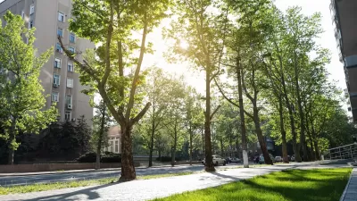
Urban Trees Have Bigger Impact in Hot, Dry Cities
The cooling effect of robust urban tree canopies is more pronounced in hotter, drier cities like Phoenix and Las Vegas.

Urban Trees Are Vital in an Era of Extreme Heat
Urban trees are essential for cooling public spaces, promoting physical activity, and protecting vulnerable populations from extreme heat.
The Economic Value of Street Trees
Far from just providing shade and improving air quality, trees can also contribute to more resilient roads, lower energy costs, and reduced flood risk.
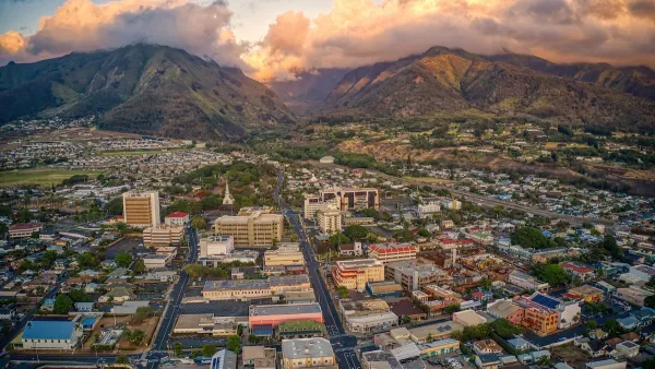
Maui's Vacation Rental Debate Turns Ugly
Verbal attacks, misinformation campaigns and fistfights plague a high-stakes debate to convert thousands of vacation rentals into long-term housing.

Planetizen Federal Action Tracker
A weekly monitor of how Trump’s orders and actions are impacting planners and planning in America.
In Urban Planning, AI Prompting Could be the New Design Thinking
Creativity has long been key to great urban design. What if we see AI as our new creative partner?

King County Supportive Housing Program Offers Hope for Unhoused Residents
The county is taking a ‘Housing First’ approach that prioritizes getting people into housing, then offering wraparound supportive services.

Researchers Use AI to Get Clearer Picture of US Housing
Analysts are using artificial intelligence to supercharge their research by allowing them to comb through data faster. Though these AI tools can be error prone, they save time and housing researchers are optimistic about the future.

Making Shared Micromobility More Inclusive
Cities and shared mobility system operators can do more to include people with disabilities in planning and operations, per a new report.
Urban Design for Planners 1: Software Tools
This six-course series explores essential urban design concepts using open source software and equips planners with the tools they need to participate fully in the urban design process.
Planning for Universal Design
Learn the tools for implementing Universal Design in planning regulations.
planning NEXT
Appalachian Highlands Housing Partners
Mpact (founded as Rail~Volution)
City of Camden Redevelopment Agency
City of Astoria
City of Portland
City of Laramie