


A color-coded map of how different states voted in the 2004 U.S. presidential election was probably the most common graphic used to convey the election results in a single picture by the news media. The following graphic by CNN uses color to highlight the states that "switched" parties. CNN: 2004 Election Results by State The New York Times had a more informative map that took into account population density.

A color-coded map of how different states voted in the 2004 U.S. presidential election was probably the most common graphic used to convey the election results in a single picture by the news media. The following graphic by CNN uses color to highlight the states that "switched" parties.

CNN: 2004 Election Results by State
The New York Times had a more informative map that took into account population density.
"This map removes mostly uninhabited areas, revealing Mr. Bush's suburban and rural support in the East and South. "

New York Times: 2004 Election Results By County and Population
The New York Times website has an interactive feature summarizing the election results. Here is an interesting pair of graphics from this feature that explains in a single picture the distribution and results of the electoral votes.


New York Times: 2004 Election Results - Electoral Votes


Planetizen Federal Action Tracker
A weekly monitor of how Trump’s orders and actions are impacting planners and planning in America.
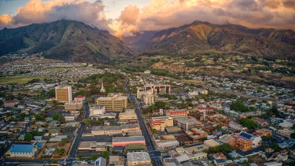
Maui's Vacation Rental Debate Turns Ugly
Verbal attacks, misinformation campaigns and fistfights plague a high-stakes debate to convert thousands of vacation rentals into long-term housing.
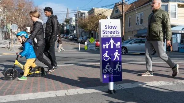
San Francisco Suspends Traffic Calming Amidst Record Deaths
Citing “a challenging fiscal landscape,” the city will cease the program on the heels of 42 traffic deaths, including 24 pedestrians.

Amtrak Rolls Out New Orleans to Alabama “Mardi Gras” Train
The new service will operate morning and evening departures between Mobile and New Orleans.

The Subversive Car-Free Guide to Trump's Great American Road Trip
Car-free ways to access Chicagoland’s best tourist attractions.

San Antonio and Austin are Fusing Into one Massive Megaregion
The region spanning the two central Texas cities is growing fast, posing challenges for local infrastructure and water supplies.
Urban Design for Planners 1: Software Tools
This six-course series explores essential urban design concepts using open source software and equips planners with the tools they need to participate fully in the urban design process.
Planning for Universal Design
Learn the tools for implementing Universal Design in planning regulations.
Heyer Gruel & Associates PA
JM Goldson LLC
Custer County Colorado
City of Camden Redevelopment Agency
City of Astoria
Transportation Research & Education Center (TREC) at Portland State University
Jefferson Parish Government
Camden Redevelopment Agency
City of Claremont