Students review municipal planning department websites in cities with more than 50,000 people to identify strengths and weaknesses. This post shares examples of the use of websites for information sharing and engagement.




Over six months, Terry Barr and Patrick Holland, master's students in City and Regional Planning, and Midori Maeda, an exchange student from the University of Tokyo, poured through more than 700 municipal planning websites for cities of 50,000 or more to understand how planners are using their websites to share information and engage with their communities.
The Good
Planning websites provide community members access to information about planning projects, plans and processes. The best websites had a clean design that allowed users to easily navigate and find what they were looking for. Some larger cities like New York and Chicago have planning websites with a substantial content that is easy to navigate. The layout and navigation strategies of their websites can be used by much smaller cities and have the same impact.
The city of San Mateo, California's planning website is a good example of layout and content that is accessible and navigable. This city is located in Northern California, with a little over 100,000 residents. Color coordination and interactive features make the website enjoyable to use.
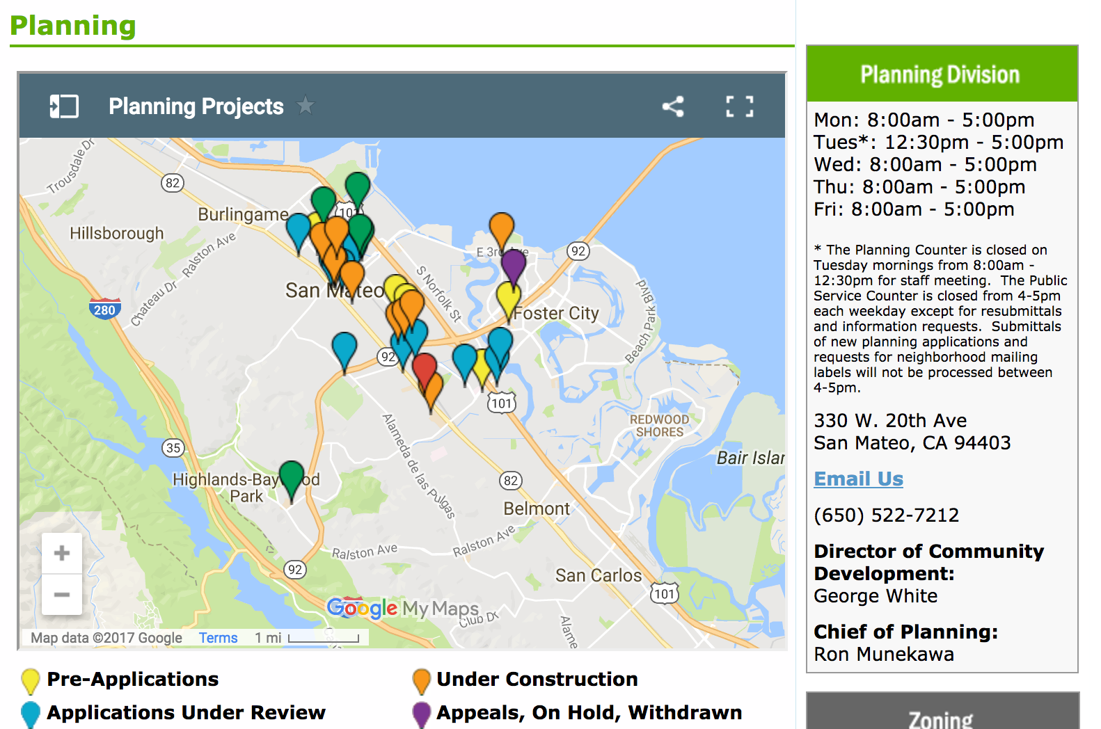
One of the key features of the San Mateo planning website is the planning project map feature, which allows users to easily interact to learn more about active development in the community. The planning projects tool is a map with pin-point projects locators where color corresponds with project types, including Pre-application, Application Under Review, Approved Application, Under Construction, Appeals, On Hold, and Withdrawn. Users can click on a project to find the location, project number, a brief description of the project, and a link to the project main page. The project page includes information on the project, including meeting dates for the project, project applicant, related documents like blue prints and renderings, and a planner's contact information.
Residents can click on a project to receive more detail about the proposed development application.

A number of cities use their website to engage with the public. The city of Fremont, California uses surveys to gather information from the community. The website provides surveys where community members can answer questions about various topic and shows the results on the website. Each survey shows the number of visitors, number of responses, and amount of time spent taking the survey.

After one completes the survey, respondents are taken to a webpage showing feedback, results, and a recap of their response. Respondents demographics are shown allowing the city to gauge the age of community members taking the survey. The results page includes a word cloud where words used in responses have different sizes based on the number of times they are repeated.
The word cloud tool allows the user the option to click on each word. After clicking on a word it filters the responses to the ones that contain the chosen word. The responses have the selected word highlighted. It helps people read responses containing certain key words. There is a search bar to allow the user to choose what word to look for words if they do not find it in the word cloud. The word cloud is attractive to the user and is the good start to sift through information.
There is a map connected with each survey, illustrating how many responses come from each part of the city. The user is able to narrow down the map to smaller sections of the city to see responses.
Opportunities to Improve
Some planning department websites had bland layouts that fail to draw a visitors attention. For example, a web page that is all text. With a little effort, many of these websites could be updated to be more appealing to visitors. Some websites had too much text on the main page, making it overwhelming for the reader and making it difficult to find specific information. Many visitors will access the website via mobile device. Less is more when it comes to organizing content. For example, creating links at the end of paragraphs that lead to further information on a topic. Some planning websites have side bar links that are not related to the content on the page. This can make it confusing to find related information.
The color of headers and body text can enhance or detract from readability. For example, we observed faint colors that had limited contrast making it difficult to read. Others used small font that was difficult to read on a mobile device. Using bold and brighter headers makes it easier to distinguish between sections. Additionally, items such as contact information should stand out from the rest of the text. This can be achieved by a larger font size, a different color or underlining.
The city of Scottsdale, Arizona uses contrasting colors and bold text in a text box to create clarity in how to contact staff members.

Scottsdale's is a better alternative to the city of West Haven, Connecticut whose contact information is inside a paragraph of text, along with hours for contact.

We observed some static maps that were difficult to read. Maps that can have elements turned on and off or even something as simple as moving pictures that are clickable help spark interest for the reader. Images or icons can help the reader know where to find the information they need quickly and not have to read a lot of text to figure out where to look. Different color for icons can be used as another tool to add contrast to the page layout to draw the reader eyes to important content.
Planning departments can undertake surveys or focus groups with people who use the website to better understand how to create pages that are user friendly. Any city regardless of size can create an effective planning website that provides valuable information and creates a user-friendly experience.

The Wisdom of Engaging Nervous Cyclists
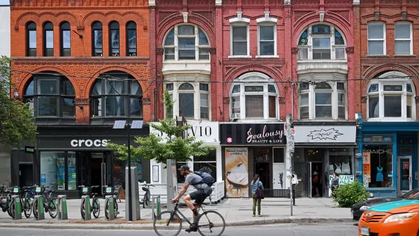
It was clear to the City of Toronto that engaging less confident cyclists that make up 60% of the population, yet seldom come to community meetings, might be the key to dramatic mode shifts in the city. Here's how it happened.
Gainesville Turns Abandoned Industrial Hub Into Innovative Park
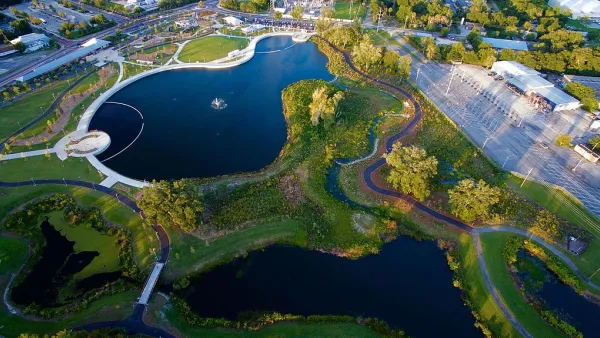
Gainesville turns contaminated land into a contemporary public greenspace to serve as the city's “Central Park."

When Conversations Turn Ugly: How to Understand Online Dialogue
Imagine that public meeting that explodes in heated argument. You've likely seen the same thing online. Learn about tools for analyzing online public engagement.
Planetizen Federal Action Tracker
A weekly monitor of how Trump’s orders and actions are impacting planners and planning in America.

Amtrak, CN end decades-long dispute with eight-year agreement
The new operating agreement establishes an updated framework for the companies to work together, including processes to resolve disputes.

Judges permit Denver to divert 77,000 acre feet from the Colorado River for reservoir expansion
Overuse and climate change have caused the Colorado River’s water levels to plummet.

Atlanta City Council unanimously backs $3.5 billion Beltline light rail project
The resolution was drafted after Atlanta Mayor Andre Dickens pulled support for the Atlanta Streetcar extension last year.

SEPTA to bring nearby frequent transit to over 1 million new riders as part of decade-long plan
The agency's Accelerate plan will also bring frequent transit to twice the amount of jobs that are currently located near it.

NYC plants over 18,000 trees, the most new foliage in a decade
Many of the trees were planted in communities vulnerable to extreme heat.

FREE Course: Walkable City 1: Why Walkability?
After describing his path towards focusing on walkability as the essence of good planning, Jeff Speck marches through his five principal reasons for making more walkable places.
Reinventing Malls: Planning Alchemy—Turning Gray Fields Into Gold
The course focuses on the opportunities and imperatives that shape reinvention of mall sites.

City of Thousand Oaks
City of Wisconsin Rapids
Harvard University Graduate School of Design
The Architects Foundation
University of Cincinnati Online
The Pocatello Development Authority
The Urban Renewal Agency of the City of Pocatello

