


A new scatterplot mapping population density against political-party preference delivers old news: urban areas tend to lean Democratic, while rural places go Republican.
The chart, created by Conor Sen using the Cook Partisan Voting Index and census data, confirms what other analysts have already observed. That is: not only do the two ends of the density spectrum gravitate toward opposing political parties, but there seems to be a consistent tipping point. Around 800 to 1,000 people per square mile, party preference switches.
Whether the apparent trend represents a solid link between population density and party affiliation remains to be seen, Emily Badger writes. Until then, the possibility that our proximity to others might directly influence our political leaning is intriguing.
FULL STORY: 'If You Live Near Other People, You're Probably a Democrat. If Your Neighbors Are Distant, Republican.'


DOT Memo Directs Transportation Funding to Communities With Higher Marriage and Birth Rates, Compliance with Immigration Officials and No Mask Mandates
The memo ties immigration enforcement to federal funding and prohibits mask or vaccine mandates.

Red Cities, Blue Cities, and Crime
Homicides rose across the nation in 2020 and 2021 but began to ebb in 2022 and 2023. Have these trends played out equally across all cities, or were they worse in cities controlled by one political party or the other?

Los Angeles Mayor Blames COVID Outbreak on Density
Appearing on a Sunday news show, Mayor Eric Garcetti noted that the Los Angeles metropolitan region is the nation's densest and one of two primary reasons why "we're seeing a person every six seconds contract COVID-19 here in Los Angeles County."

Planetizen Federal Action Tracker
A weekly monitor of how Trump’s orders and actions are impacting planners and planning in America.

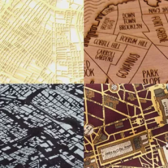
Chicago’s Ghost Rails
Just beneath the surface of the modern city lie the remnants of its expansive early 20th-century streetcar system.

Amtrak Cutting Jobs, Funding to High-Speed Rail
The agency plans to cut 10 percent of its workforce and has confirmed it will not fund new high-speed rail projects.

Ohio Forces Data Centers to Prepay for Power
Utilities are calling on states to hold data center operators responsible for new energy demands to prevent leaving consumers on the hook for their bills.

MARTA CEO Steps Down Amid Citizenship Concerns
MARTA’s board announced Thursday that its chief, who is from Canada, is resigning due to questions about his immigration status.

Silicon Valley ‘Bike Superhighway’ Awarded $14M State Grant
A Caltrans grant brings the 10-mile Central Bikeway project connecting Santa Clara and East San Jose closer to fruition.
Urban Design for Planners 1: Software Tools
This six-course series explores essential urban design concepts using open source software and equips planners with the tools they need to participate fully in the urban design process.
Planning for Universal Design
Learn the tools for implementing Universal Design in planning regulations.
Caltrans
City of Fort Worth
Mpact (founded as Rail~Volution)
City of Camden Redevelopment Agency
City of Astoria
City of Portland
City of Laramie