


What is wrong with this map?

What is wrong with this map?

The map shown above is from a series created by the Worldmapper project and shows greenhouse gas emissions. It is an equal area cartogram in which each territory is "resized according to the variable being mapped". These maps are useful for making visual comparisons:


Greenhouse Gas Emissions
Source: Worldmapper
(Some other maps of interest to Planetizen readers: commuting time, public transport, passenger cars and a dramatic map on forest depletion.)
The World Wildlife Fund uses a more familiar thematic map to illustrate the concept of "eco-debtors" and "eco-creditors". WWF defines countries that consume more resources than they can recover or release more CO2 than they can can absorb themselves are "eco-debtors".

Source: WWF / BBC
An interesting new web-based tool for exploring data is Gapminder's Trendanalyzer which aims to reveal "the beauty of statistics by converting boring numbers into enjoyable interactive animations." You can try it out at "Gapfinder World 2006". Trendanalyzer was recently acquired by Google. Here is a screenshot of CO2 emissions (metric tons per capita).

Source: Google / Gapminder
All of the above provide a global view of climate change. But what does it mean to me personally? Visit Alex Tingle's Flood Maps website which shows the areas that might flood as a result of global warming. Flood Maps has its limitations of course, but there is no denying the impact of seeing streets and neighborhoods you recognize under a blue pattern indicating possible flooding.

Source: Flood Maps by Alex Tingle
That's a map for the Southern California area. Are you in New York? Or Sacramento, CA?


New Tool Aims to Make Parks More Resilient to Climate Change
The interactive mapping platform helps park managers understand the risks in their area and create long-term resilience plans.

New Tool Prepares Rhode Island for Rising Seas
A new mapping tool shows the potential devastation along the Rhode Island coast caused by rising waters from climate change and storm surges.
Mapping Climate Change
Climate change is now being visualized in 3D maps on Google Earth.

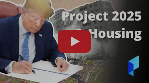
Planetizen Federal Action Tracker
A weekly monitor of how Trump’s orders and actions are impacting planners and planning in America.

Chicago’s Ghost Rails
Just beneath the surface of the modern city lie the remnants of its expansive early 20th-century streetcar system.

Amtrak Cutting Jobs, Funding to High-Speed Rail
The agency plans to cut 10 percent of its workforce and has confirmed it will not fund new high-speed rail projects.

Ohio Forces Data Centers to Prepay for Power
Utilities are calling on states to hold data center operators responsible for new energy demands to prevent leaving consumers on the hook for their bills.

MARTA CEO Steps Down Amid Citizenship Concerns
MARTA’s board announced Thursday that its chief, who is from Canada, is resigning due to questions about his immigration status.

Silicon Valley ‘Bike Superhighway’ Awarded $14M State Grant
A Caltrans grant brings the 10-mile Central Bikeway project connecting Santa Clara and East San Jose closer to fruition.
Urban Design for Planners 1: Software Tools
This six-course series explores essential urban design concepts using open source software and equips planners with the tools they need to participate fully in the urban design process.
Planning for Universal Design
Learn the tools for implementing Universal Design in planning regulations.
Caltrans
City of Fort Worth
Mpact (founded as Rail~Volution)
City of Camden Redevelopment Agency
City of Astoria
City of Portland
City of Laramie